



The email editor gives you a visual and flexible way to create emails in Conference Manager. Build the layout with drag and drop, add different types of content and customise individual elements directly in the editor.
If you have used the Website Designer, the email editor may feel familiar. Content is built in layers, and you can drag and drop Columns, Text, Images and other Blocks into the layout. You can also move outwards through the structure to select a parent element.
Select Save template regularly while you work, not only when the email is finished. If your session expires or your internet connection drops, changes you have not saved can be lost.
Choose your guide
Choose what you want to change in the email, then watch how it is done or try it yourself in a copy of the email editor.
Use this version when the standard layout already suits your email. The starter template has a width of 600 px, which is a common width for email. Keep the starter template and change only the branding, text, colours and links you need.
Open the editor
Open the email flow you want to work with and select the available create button, for example Create template or Create new invitation. New emails and templates open in the email editor.
Where the email editor is available, new emails are created in the email editor and you can no longer create new emails with plain text. Confirmation emails are the exception, as you can choose between plain text and the email editor. If you copy an event, its email templates are copied too, including templates created with plain text. They are listed under Templates with plain text, where you can view them. If you do not have any plain text templates, this section is not shown.
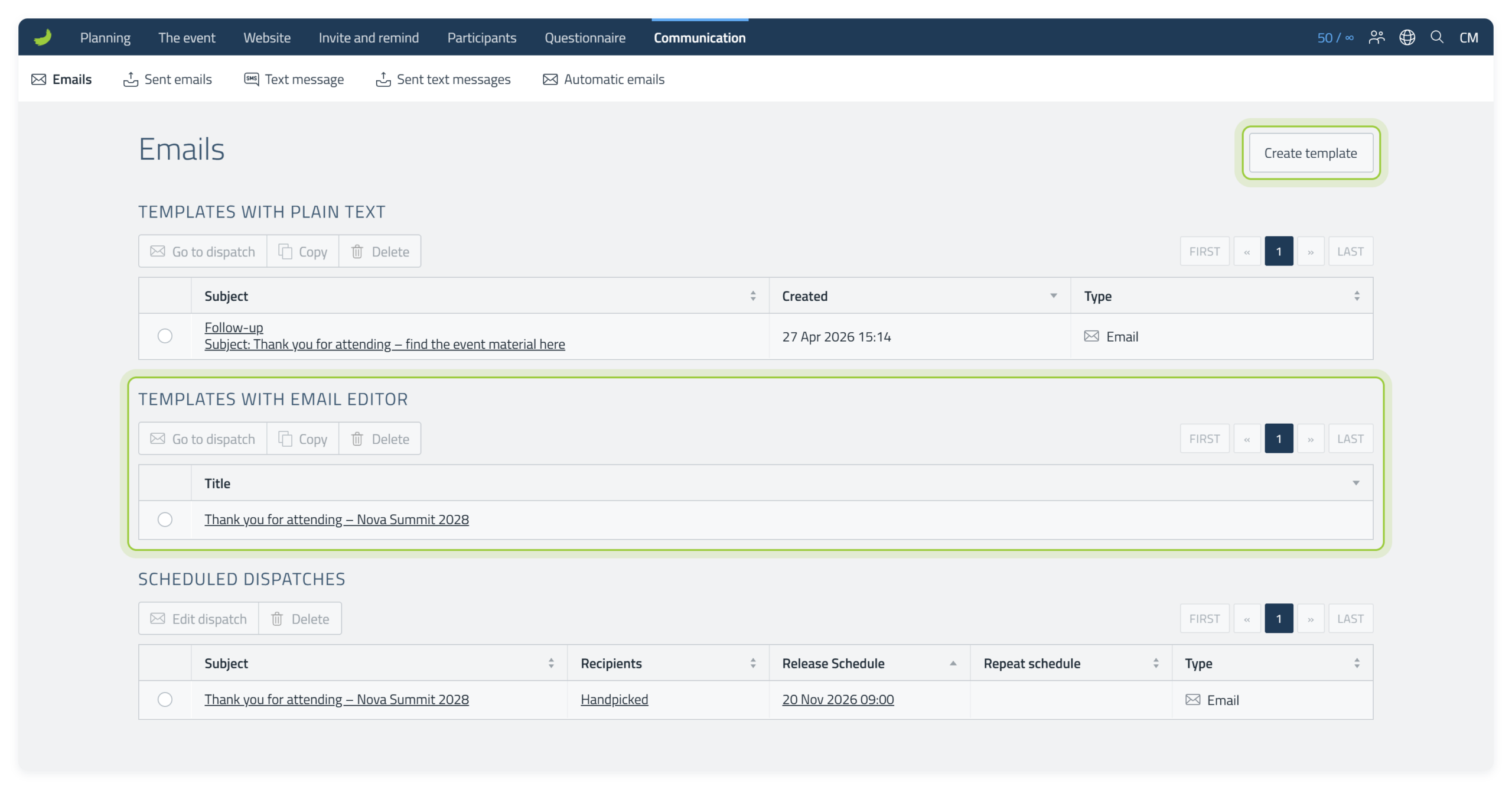
Quick toolbar reference
Before you continue, these are the main toolbar controls used in the steps below.




Replace the logo or header image
Double-click on the Conference Manager logo in the starter template to open the Media Library. Choose the logo or header image you want to use and select Insert.
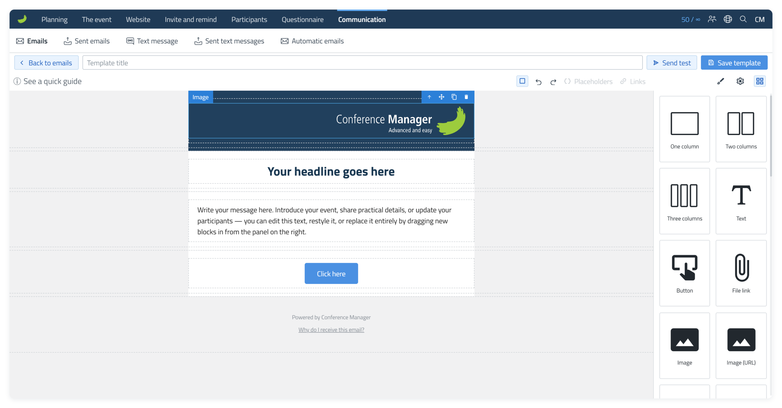
Choose the replacement
Select the logo or image you want to use in the Media Library.
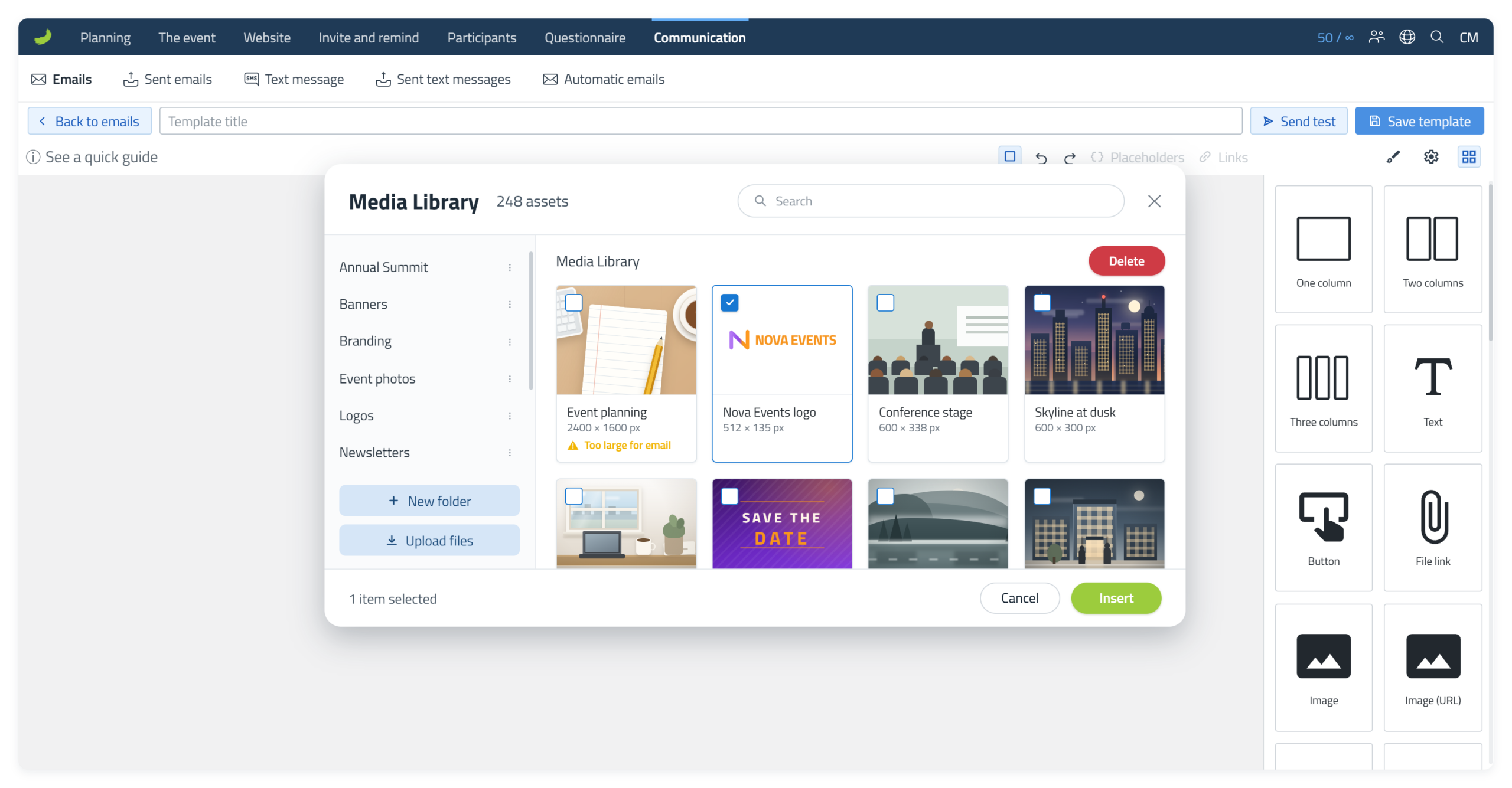
Adjust it in the email
Once inserted, select the image and use Style Manager ( ) if you want to adjust its size or spacing.
Tools for your email images
Change the colours
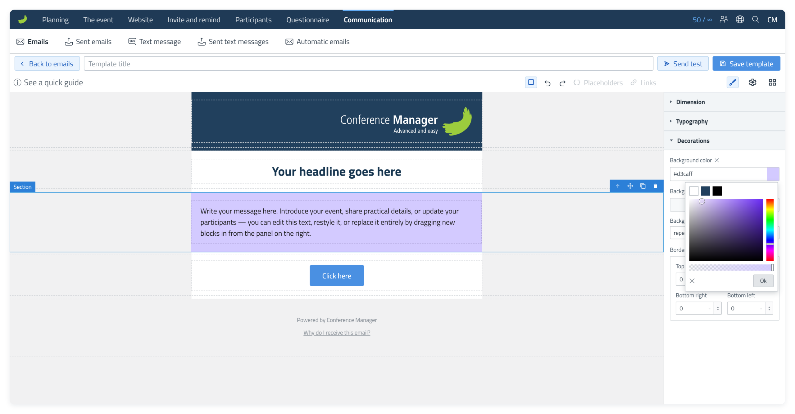
Start with the header. Click the header Section to select it, open Style Manager () and go to Decorations Background colour. Click the colour field to open the colour picker, then choose a colour visually or enter an exact hex code.
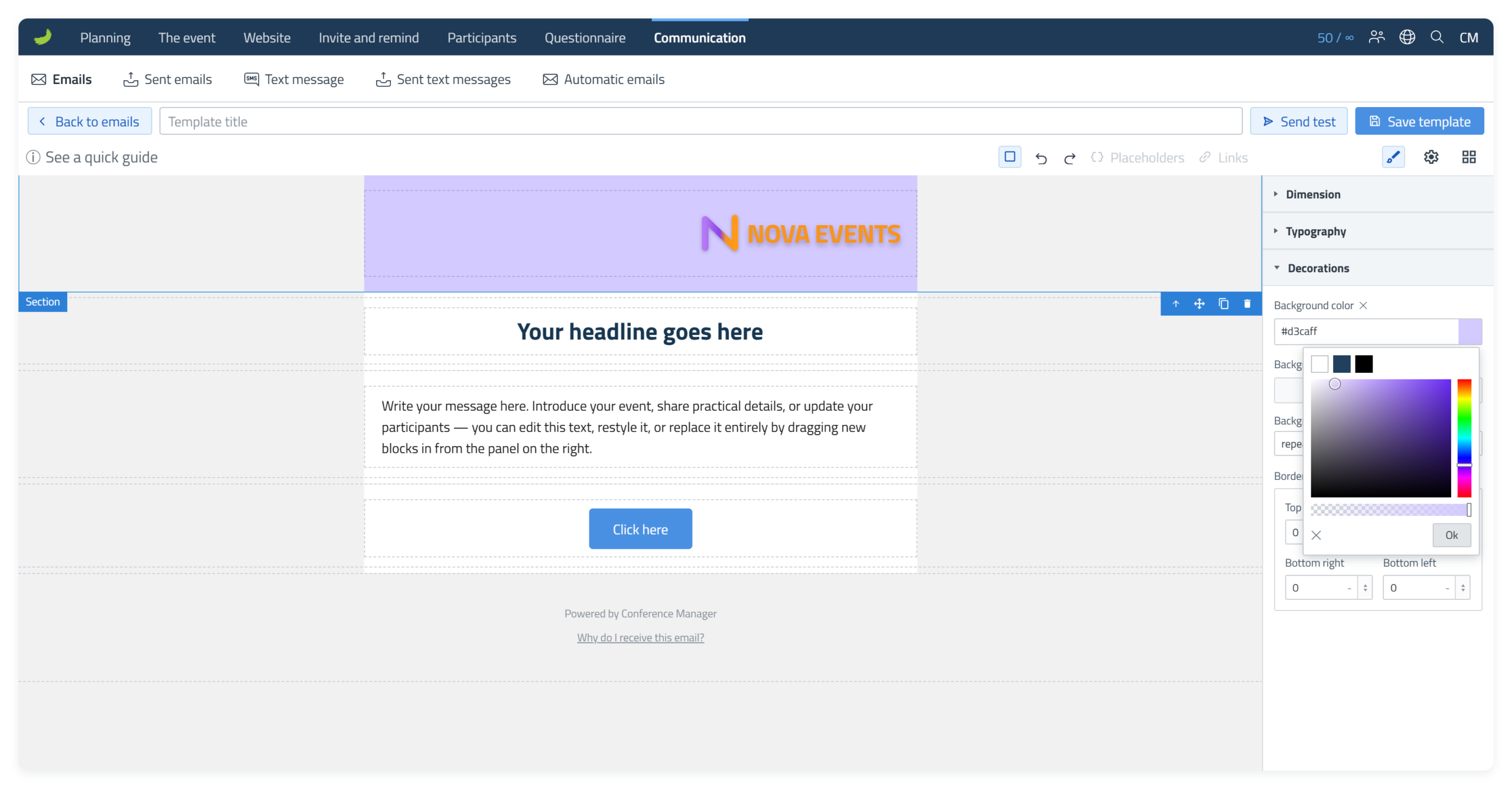
You can change the background colour of the other Sections in the email in exactly the same way: select the Section, open Style Manager () and change Background colour.
Edit the existing text
Double-click a headline or body text to edit it directly. You do not need to replace the existing Text element.
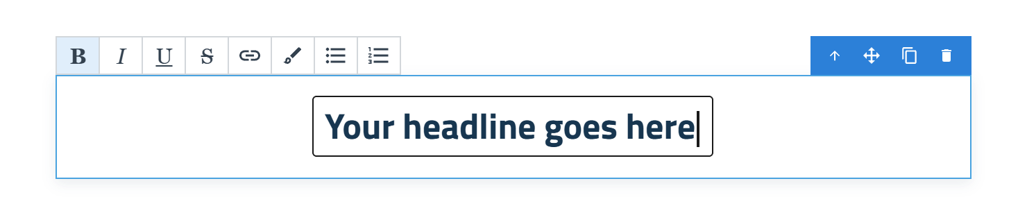
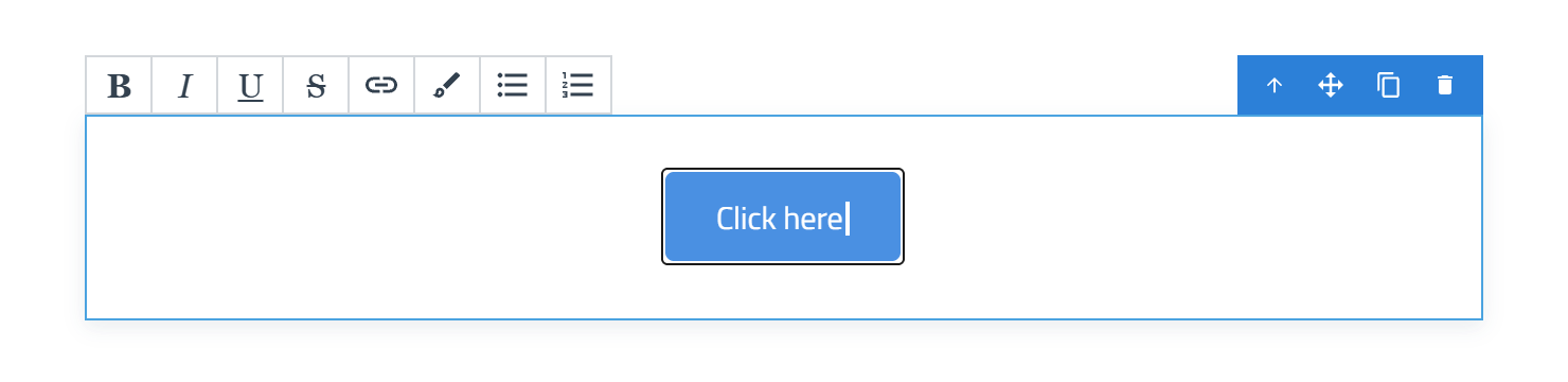
When you edit a Text element, the inline toolbar gives you quick access to common formatting such as Bold, Italic, Underline, Strikethrough, links, bulleted lists and numbered lists.
Add another element
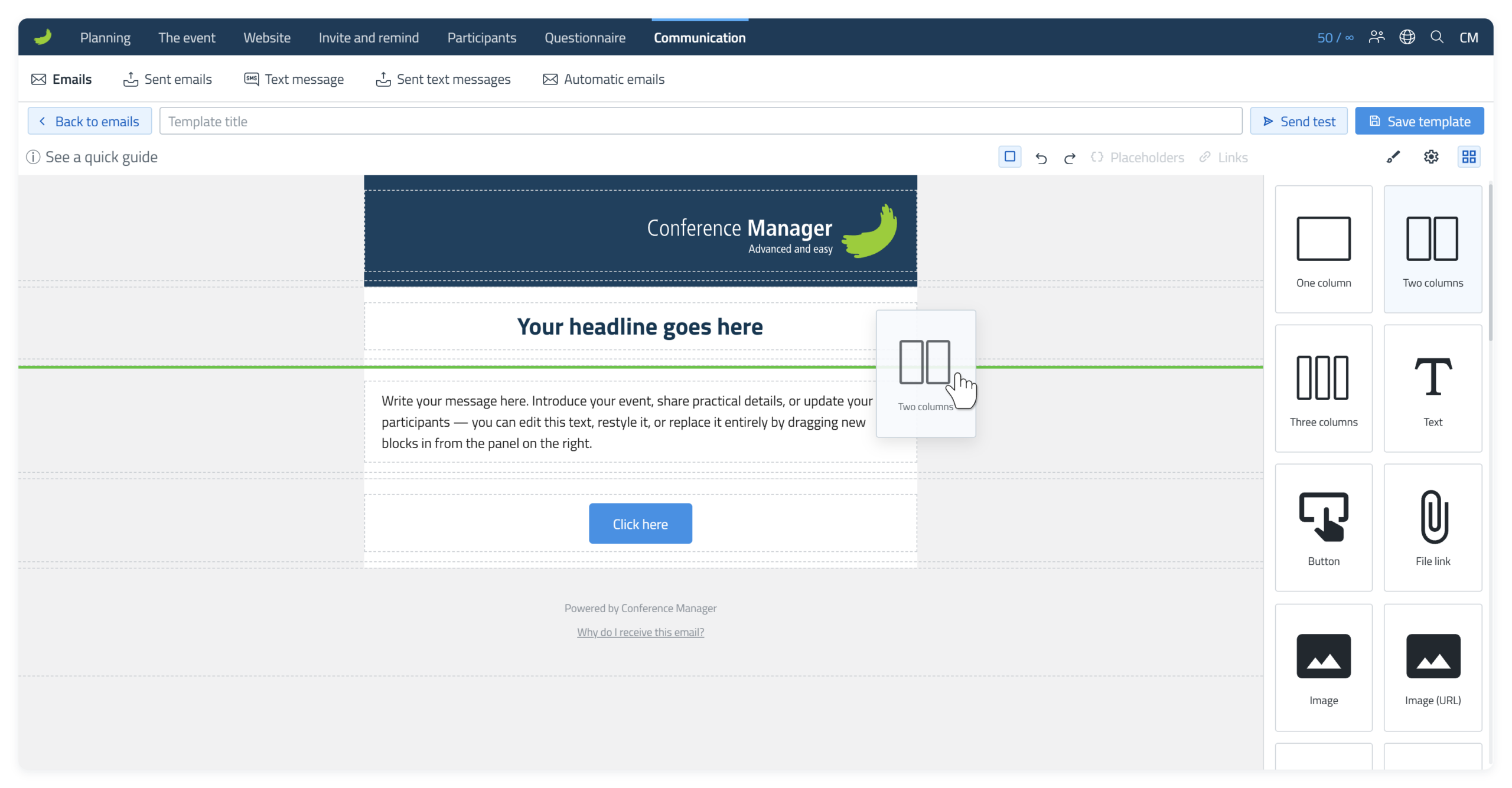
If you want to add something that is not already in the starter template, open Blocks ( ) on the right and choose the element you need. Drag the element into the email and drop it where the green line appears. The green line shows where the element will be inserted.
Update the button
Click the button once to select it. In Component settings ( ), use Link (URL) for a normal web address or Internal link for a destination provided by Conference Manager.
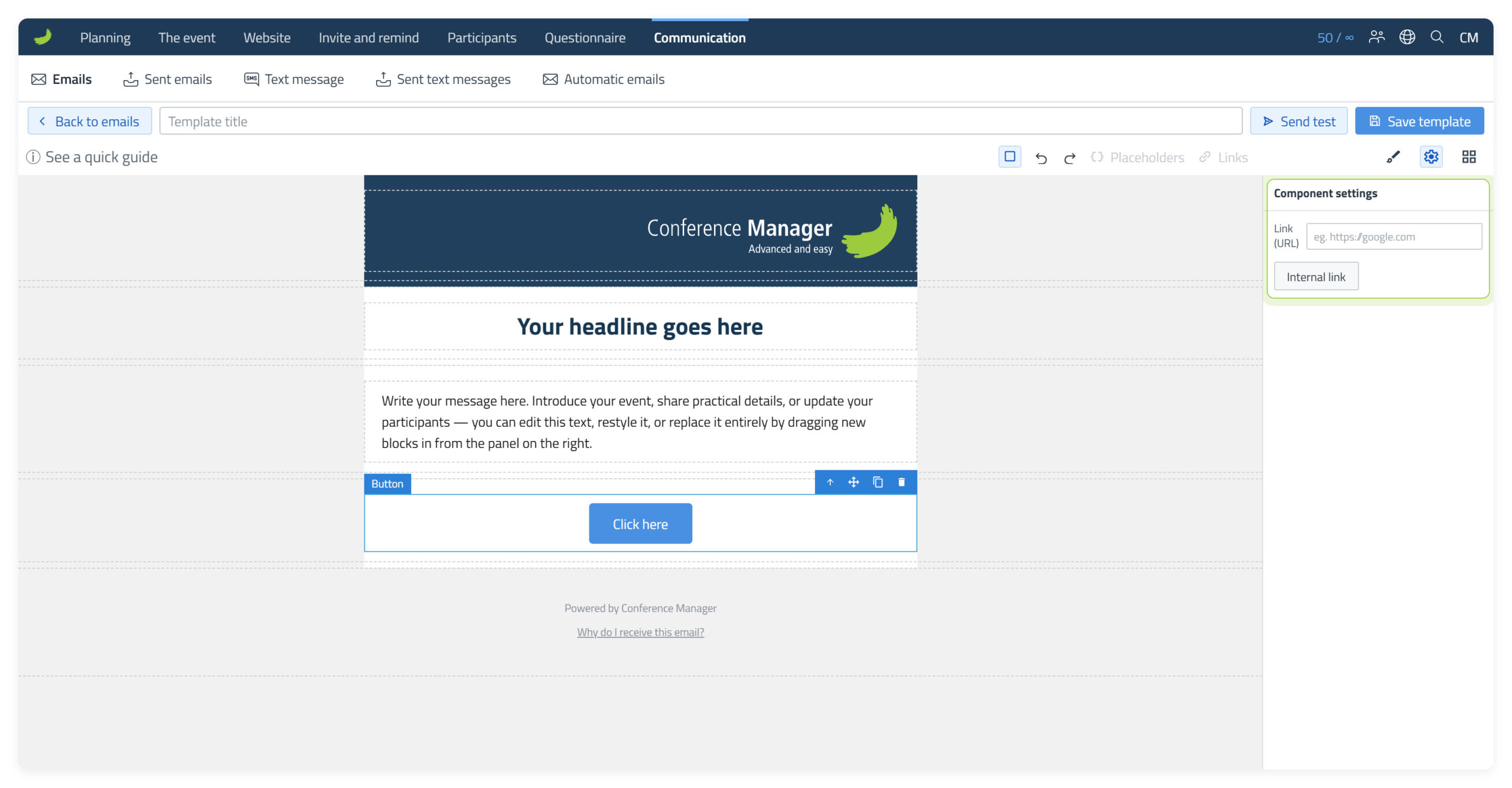
Use Style Manager () to change the appearance of the button. Double-click on the button to edit the text shown on the button.
Send the email
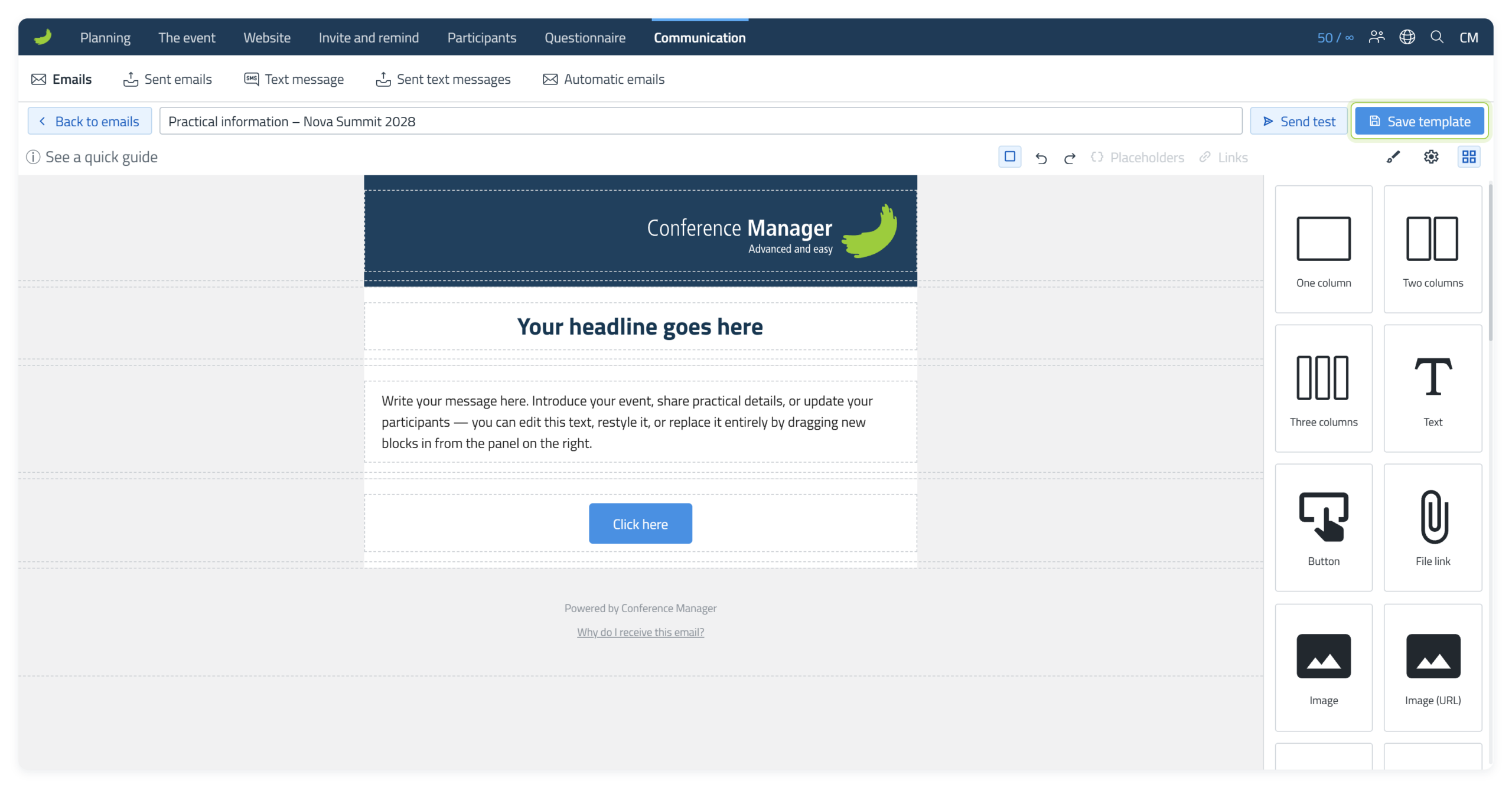
Before sending, select Send test to send the current version to yourself and check it in your inbox.
When the email is ready, enter a template title, select Save template and continue to Dispatch. Dispatch has three steps: Email, Recipients and Schedule.
1. Email
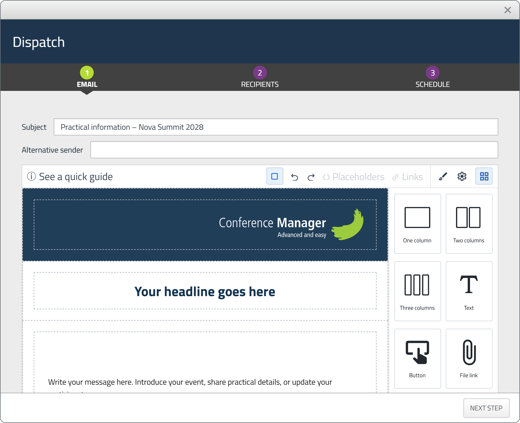
Review the email before you continue. The Subject is prefilled with the template title, but you can change it for this Dispatch.
2. Recipients
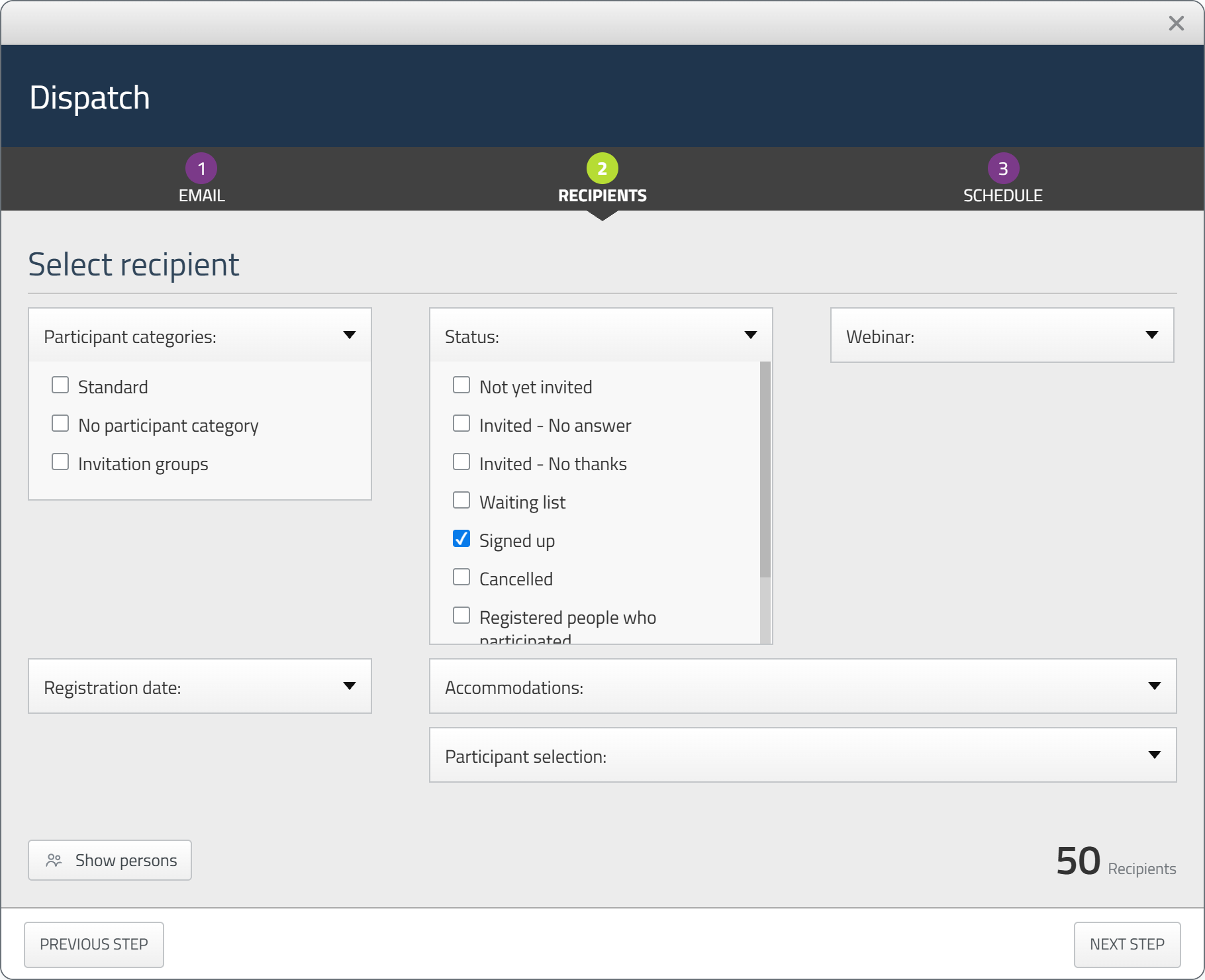
Select who should receive the email and use the available filters if needed.
3. Schedule
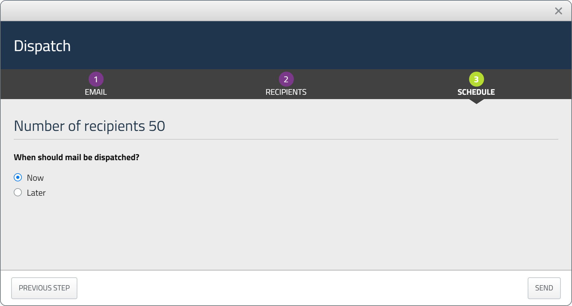
Choose whether the email should be sent Now or Later, then complete the dispatch.
Related guideEmail examplesFive example emails with structure and step-by-step instructions.Read the guideOpen the email editor
For most emails in Conference Manager, new emails and templates are created with the email editor.
- Confirmation emails: You can choose between plain text and the email editor. Confirmation emails are covered later in this guide.
- Automatic emails, invoice and credit note emails, and external login emails: These still use plain text.
System emails that are sent automatically, such as webinar link emails, are not editable. These emails continue to use their existing design.
Create an email
Select the create button in the email flow you are working with. The label depends on the flow, for example Create template under Communication or Create new invitation under Invite and remind. New emails and templates open in the email editor.
Where the email editor is available, new emails are created in the email editor and you can no longer create new emails with plain text. Confirmation emails are the exception, as you can choose between plain text and the email editor. If you copy an event, its email templates are copied too, including templates created with plain text. They are listed under Templates with plain text, where you can view them. New templates are created with the email editor. If you do not have any plain text templates, the Templates with plain text section is not shown.
Copy a template
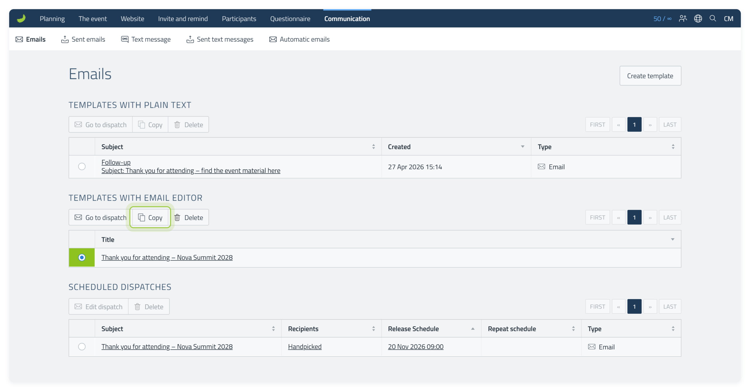
To reuse an email, select the template in the list under Templates with email editor and select Copy. The message Email template copied appears, and the copy is added to the list with (copy) after the title. Open the copy to edit it, and give it a new template title so the two are easy to tell apart.
Get to know the editor
The canvas in the centre shows the email. The toolbar contains the main editing actions, while the panel on the right changes depending on what you want to do.
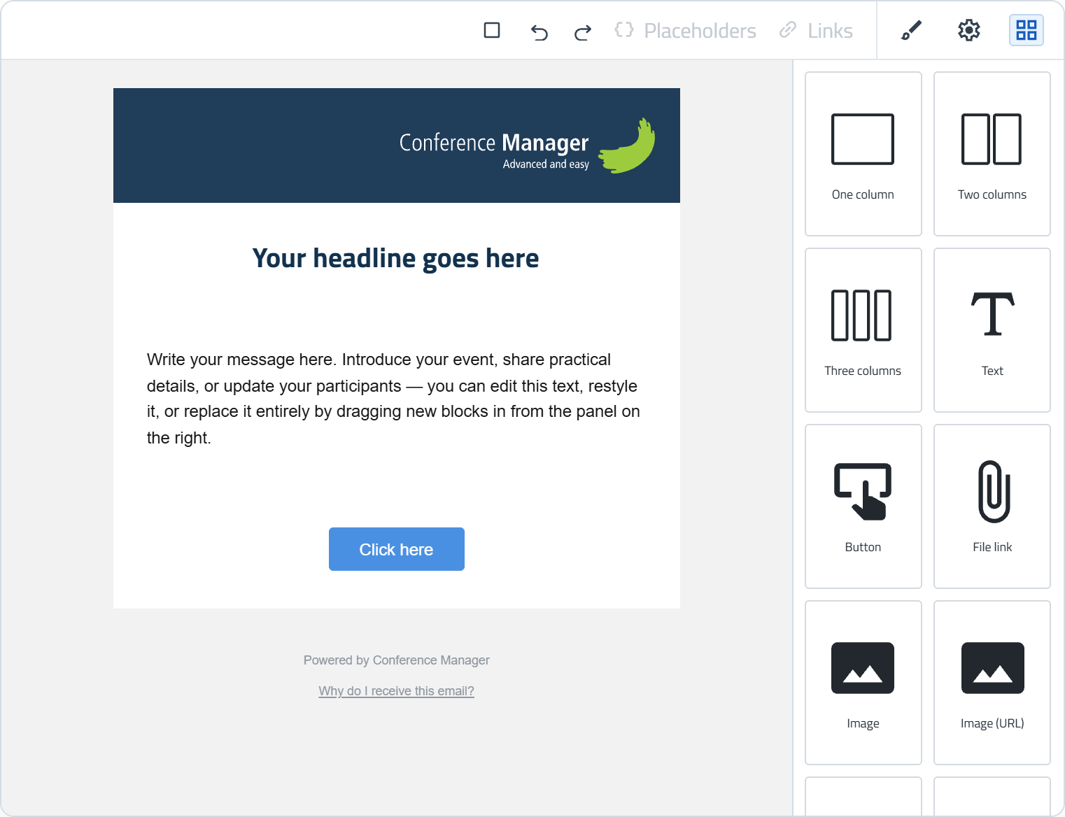
When you create a new email, the editor starts with the starter template. You can use this as your starting point and edit or replace the existing text, images, buttons and other elements. You can also delete any elements you do not need and add new Blocks to create your own layout.
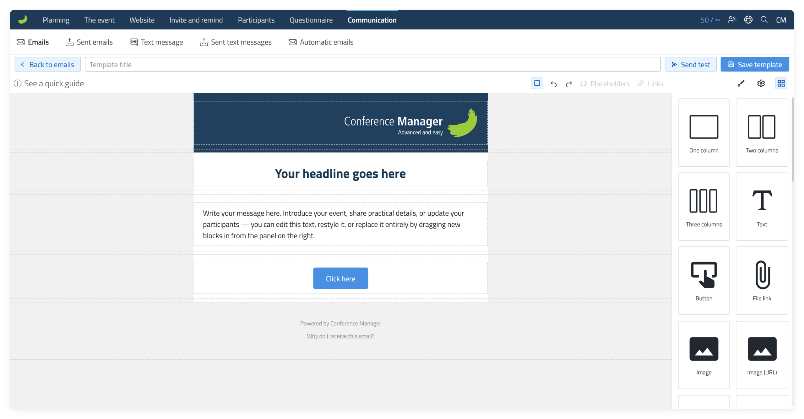
You do not have to keep the standard template as it is. Keep and customise the elements you want, delete the ones you do not need, and add new Blocks wherever needed.
The footer cannot be removed. The footer at the bottom of the email is a required part of the email, but you can customise its appearance using the available styling settings, for example by changing its colours.
Toolbar and panels
The toolbar above the canvas contains the main editing controls. The three icons on the right open Style Manager (), Component settings () and Blocks ().
Style Manager
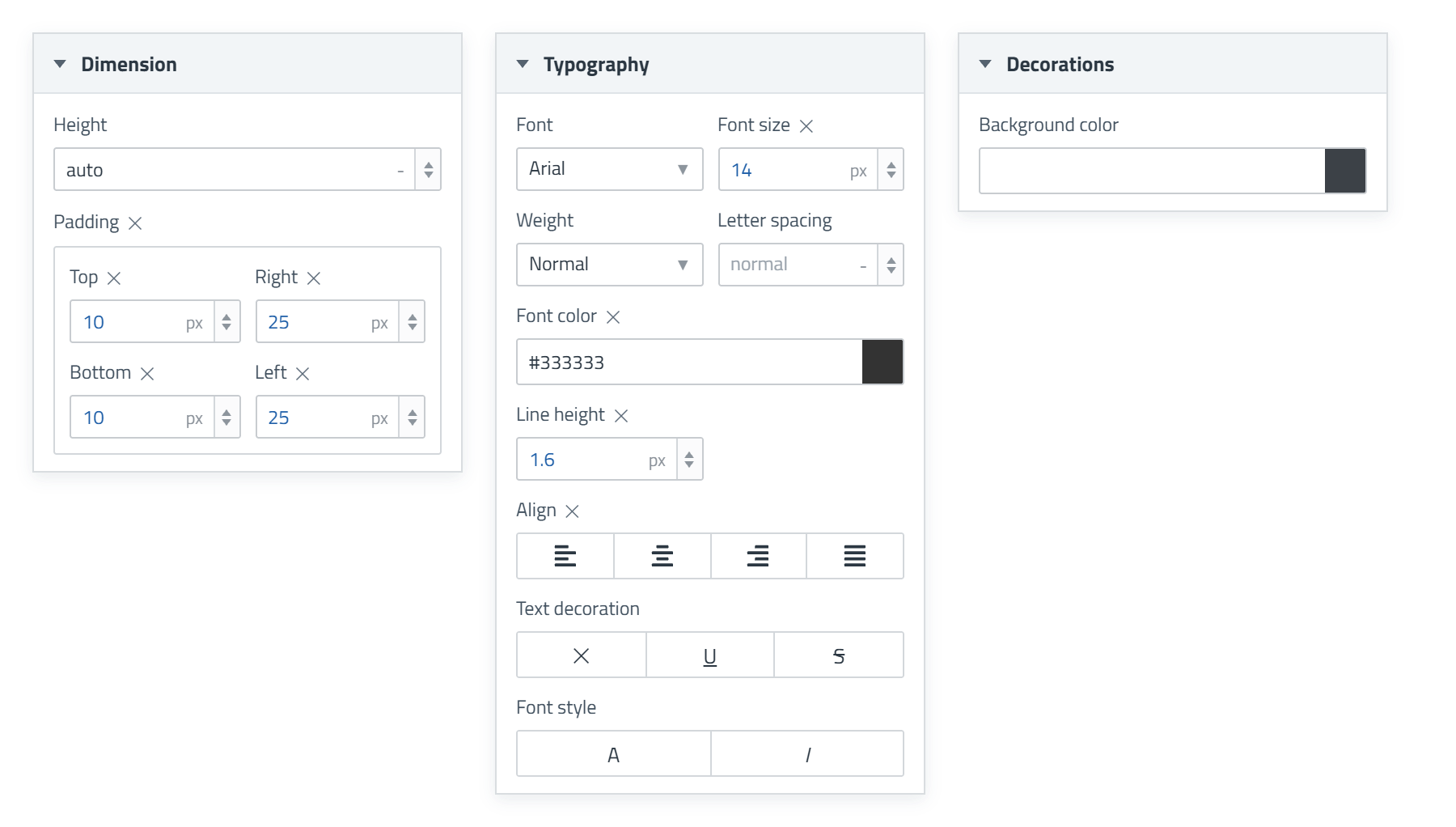
Style Manager () controls how the selected element looks. The available options depend on the selected element and can include Dimension, Typography and Decorations.
Component settings
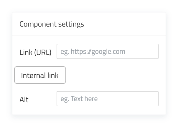
Component settings () contains options that are specific to the selected element. This is an example of the settings for an Image element.
Blocks
The Blocks () panel contains the layouts and content elements you can drag into the email.
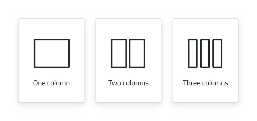
Layout Blocks
Content Blocks

Wallet banner is only shown when Wallet Pass is turned on, and not in invitations.
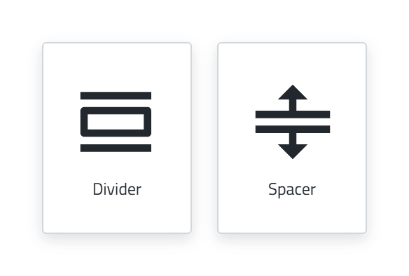
Spacing Blocks
Click or double-click
You do not need to build the email from scratch. The starter template already contains text, images, buttons and other elements that you can edit directly. Click or double-click the element you want to change, depending on the element type.
Click an element once to select it. Then use Style Manager () to change its appearance and Component settings () for element-specific settings such as links.
Double-click a heading, body text or button to edit the text directly in the email. The inline toolbar appears when text is active.
Double-click an existing image, for example the Conference Manager logo, to open the Media Library and choose a replacement.
The individual element types and their settings are covered in more detail later in the guide.
Select and navigate elements
An email is built from layers nested inside one another. Understanding the layers makes it easier to select the correct Section, Column or content element.
View components
Turn on View components ( ) to reveal the dashed boundaries between the layers. These boundaries are only editing aids and are not included in the email that recipients receive.
- View components on
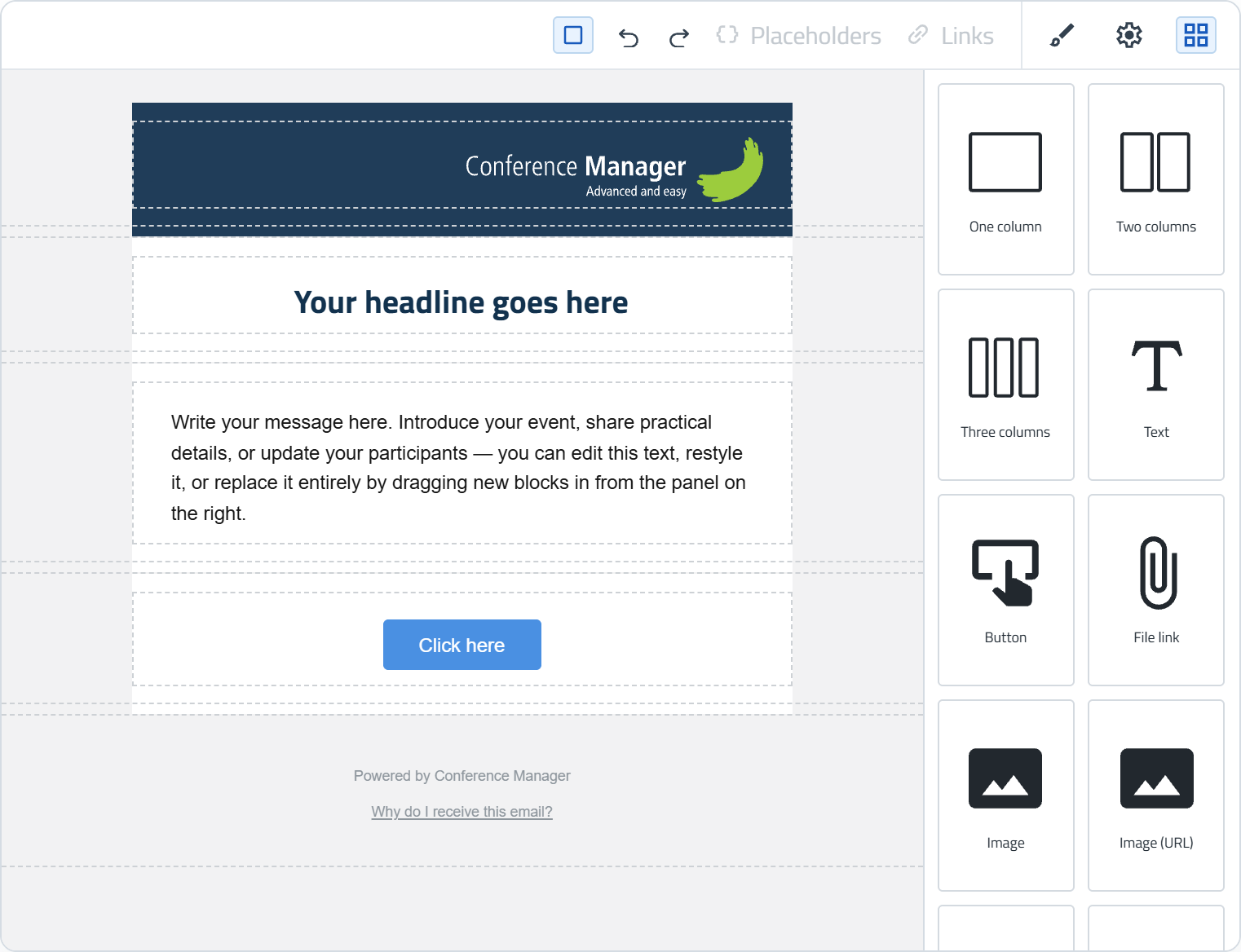
- View components off
Select and understand the layers
Move your cursor over the email to see which layer will be selected. The screenshot below shows the nested layers in the editor.
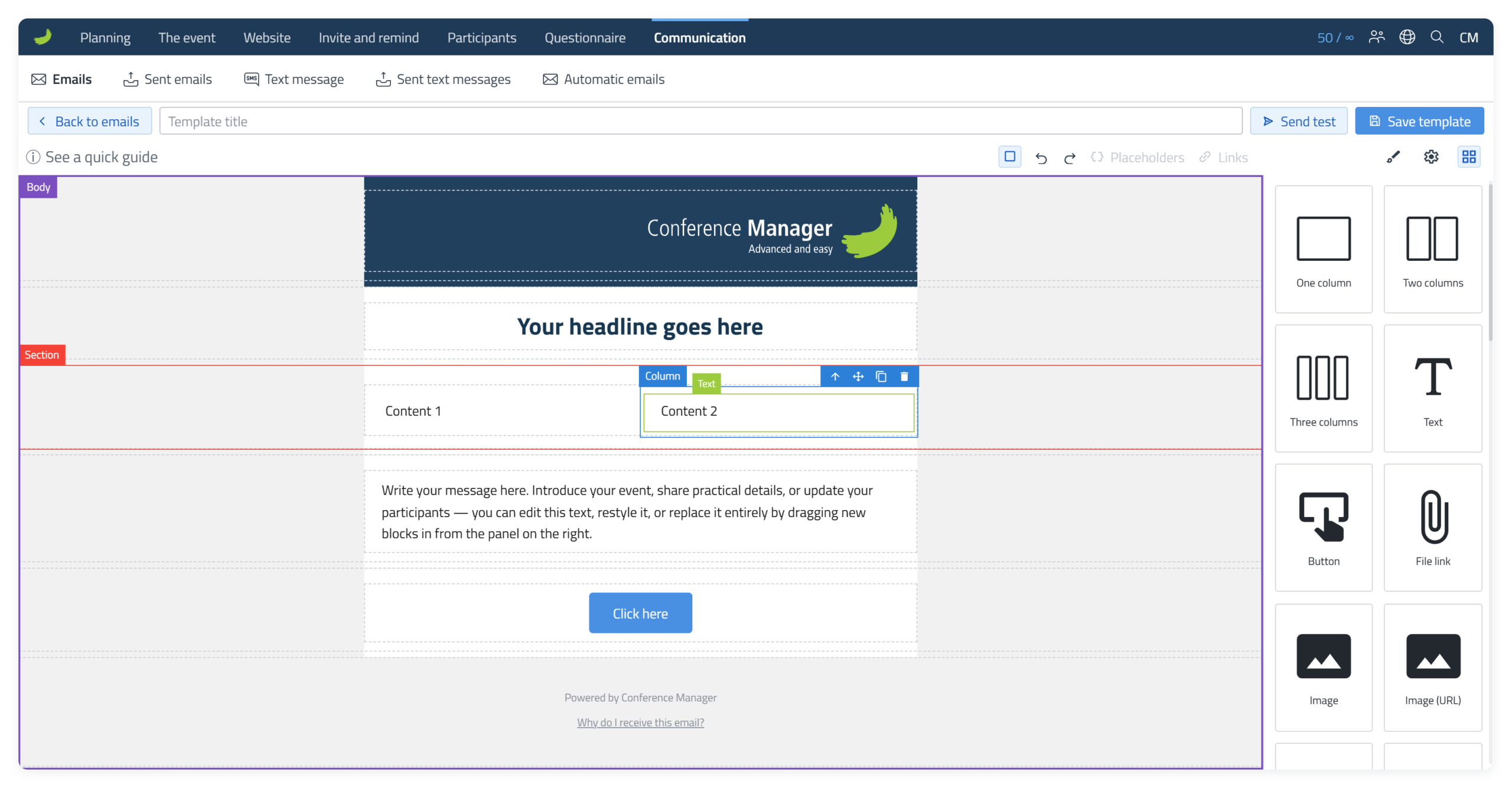
- Body
- Section
- Column
- Text or another content element
Select a parent layer
After selecting an inner element, use the up arrow to move one level outwards. Move your cursor to the next up arrow and click again if you want to move another level out. The animation below shows the selection moving from Text to Column, then Section and finally Body.
Body
Body is the outermost layer of the email and contains all Sections.
The most reliable way to select Body is to select an element inside the email and use the Select parent ( ) up arrow to move out through the parent layers. If the email is short enough to leave an empty area below the footer, you can also click in that empty area to select Body directly. If the email content fills the available height, this empty area is not shown, so use Select parent () instead.
Email width and surrounding background
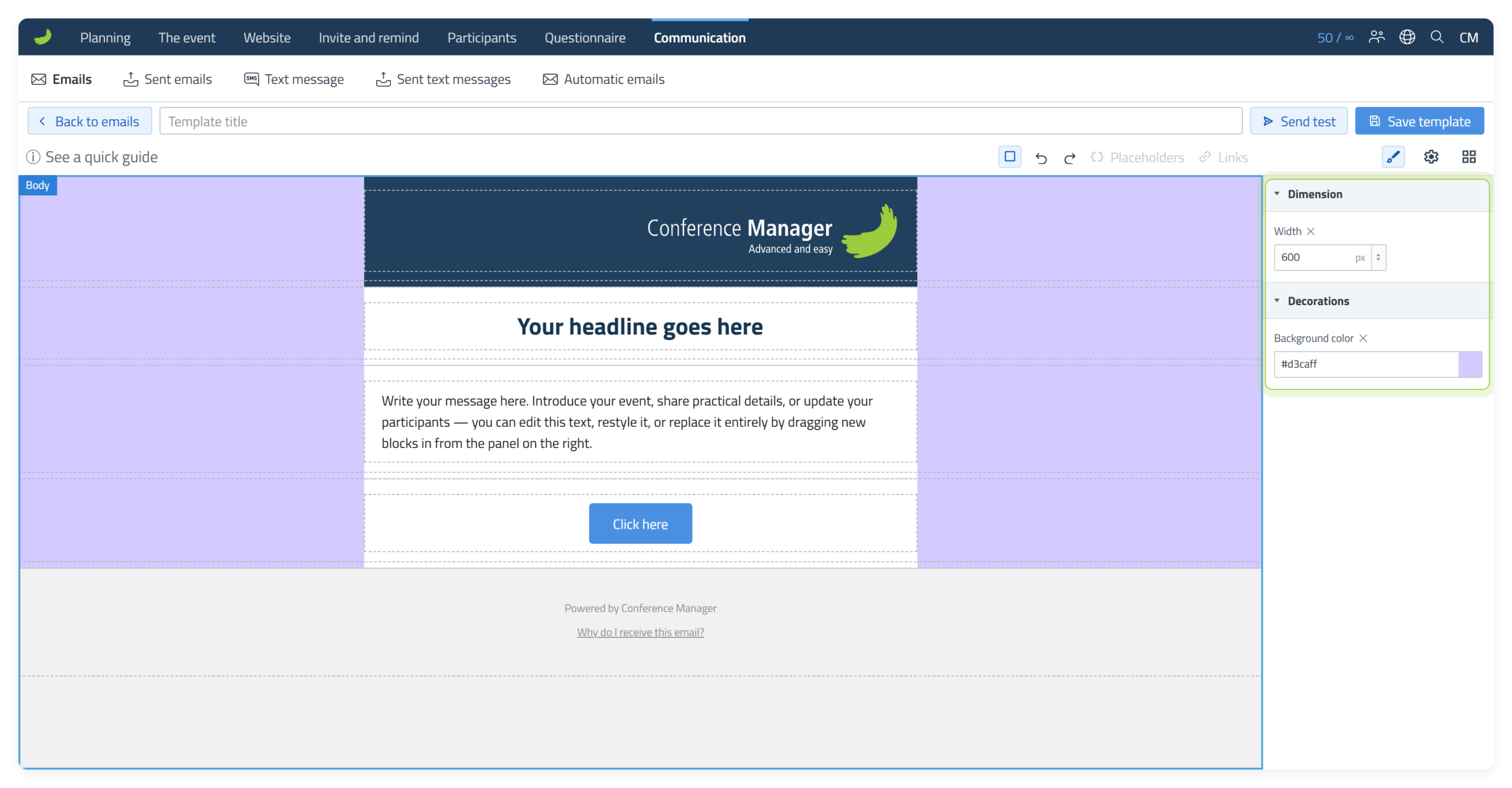
When Body is selected, Style Manager () contains settings that affect the email as a whole.
Width controls the width of the central email content area where your Sections and content are placed. Around 600 px is a common email width. This is not a separate mobile width: on narrower screens, the email is displayed within the available screen width.
Background colour controls the area surrounding the email content. This is most visible on wider screens where there is space on either side of the email.
This is different from a Section background colour. A Section background changes a specific area inside the email, while the Body background surrounds the email content as a whole.
Element controls
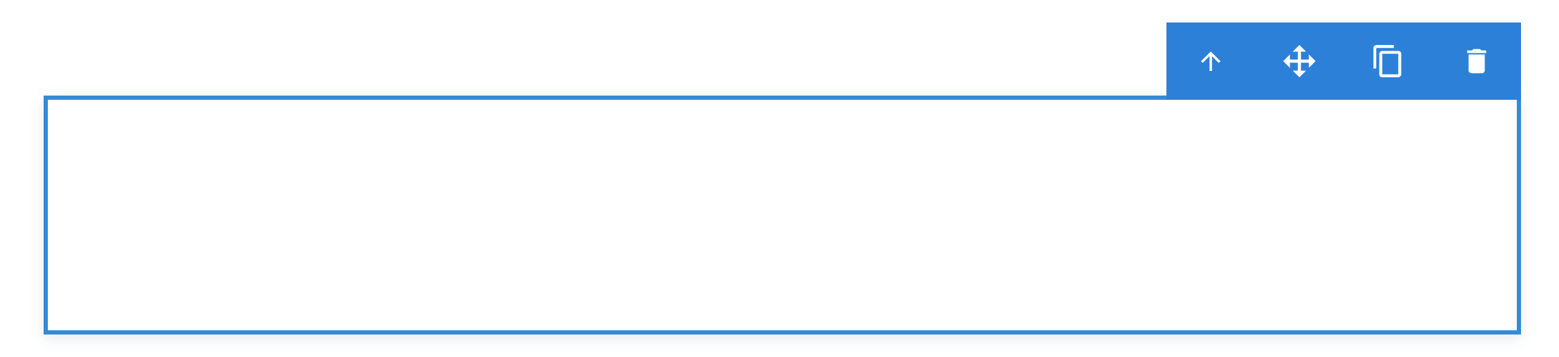
When an element is selected, the blue control bar gives you four actions. The icons below match the controls shown in the editor.


Build and edit the email
Use the layout Blocks to arrange the email, then add and edit the content inside the Columns.
Add a layout
Use One column, Two columns or Three columns to decide how content should be arranged across a Section. Drag the required layout Block from the Blocks panel into the email.
When a green insertion line appears, it shows a valid place where the Block can be dropped.
When you add a layout, a new Section is automatically created with the number of Columns you selected.
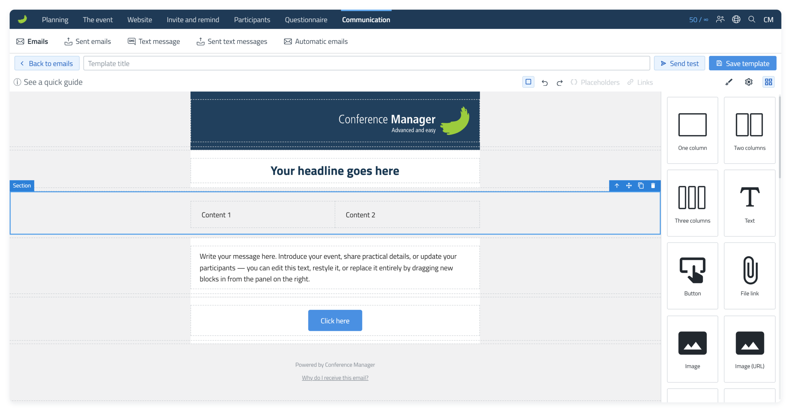
When you drag a new Column layout into the email, each Column contains a Text element by default. You can keep the Text element and edit it, or delete it and drag another content Block into the Column instead.
Change the width of a Column
Click the element in the Column and select Select parent () to select the Column. Open Style Manager () and enter a value in Width under Dimensions, for example 150 px. The other Columns keep their width. Delete the value to go back to the automatic width.
Style the Section
The new row is a Section. Select the Section when you want to style the whole horizontal area rather than an individual Column or content element.
Change the Section background colour
Select the Section and open Style Manager (). Under the relevant colour setting, you can give that Section its own background colour. This is useful when you want different parts of the email to stand out from one another.
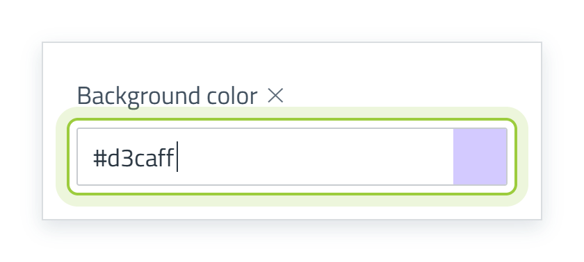
Enter a hex code
If you know the exact colour, enter its hex value directly, for example #d3caff.
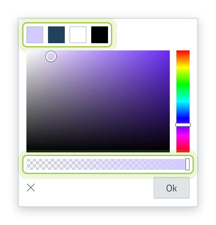
Use the colour picker
Click on the colour field to open the colour picker and choose a colour visually. Colours already used in the email are shown at the top of the colour picker, making it easy to reuse them.
Use the opacity bar at the bottom of the colour picker to make the colour more or less transparent. Drag it towards the transparent side for a lighter, see-through effect, or towards the solid side for a fully opaque colour.
Full width
By default, a Section follows the width of the main email content area. If you want the selected Section to extend beyond this central area and across the available width, open Component settings () and turn on Full width.
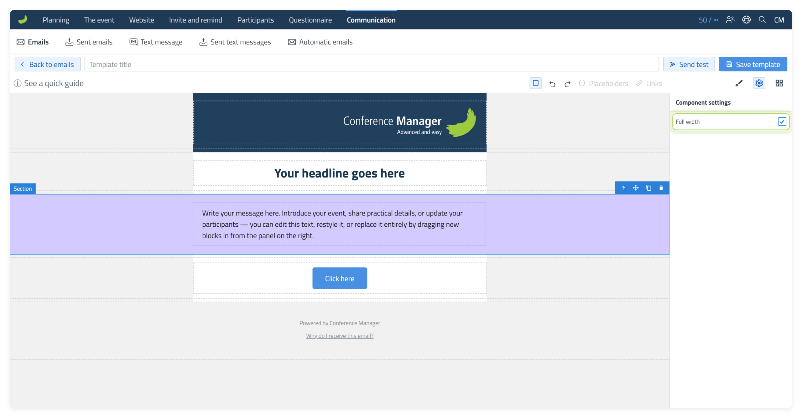
Full width extends the Section background beyond the central email area. How much of this background is visible can vary between email clients, screen sizes and devices.
Background image
Select the Section, open Style Manager () and choose Images under Decorations Background image. Choose the image in the Media Library and select Insert. The image is placed behind the content of the Section. Use Background size cover to make it fill the Section.
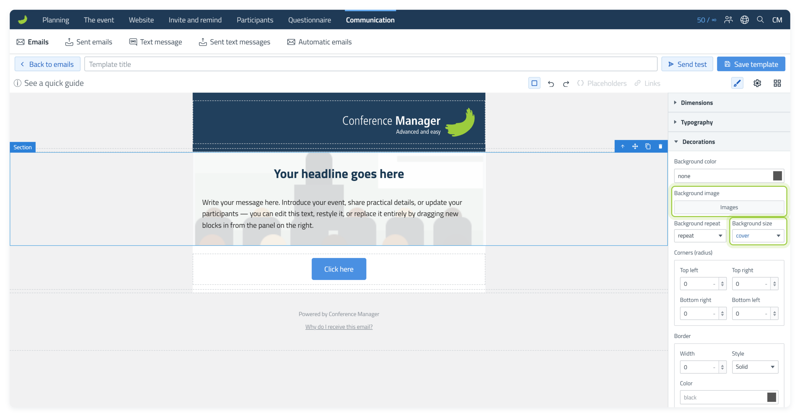
Background images are not shown in all email clients, for example Outlook for Windows. Choose a background colour as well, so the text can still be read without the image.
Add content to a Column
Content Blocks such as Text, Button and Image are placed inside Columns. Drag the Block into the required Column and drop it where the green insertion line appears.
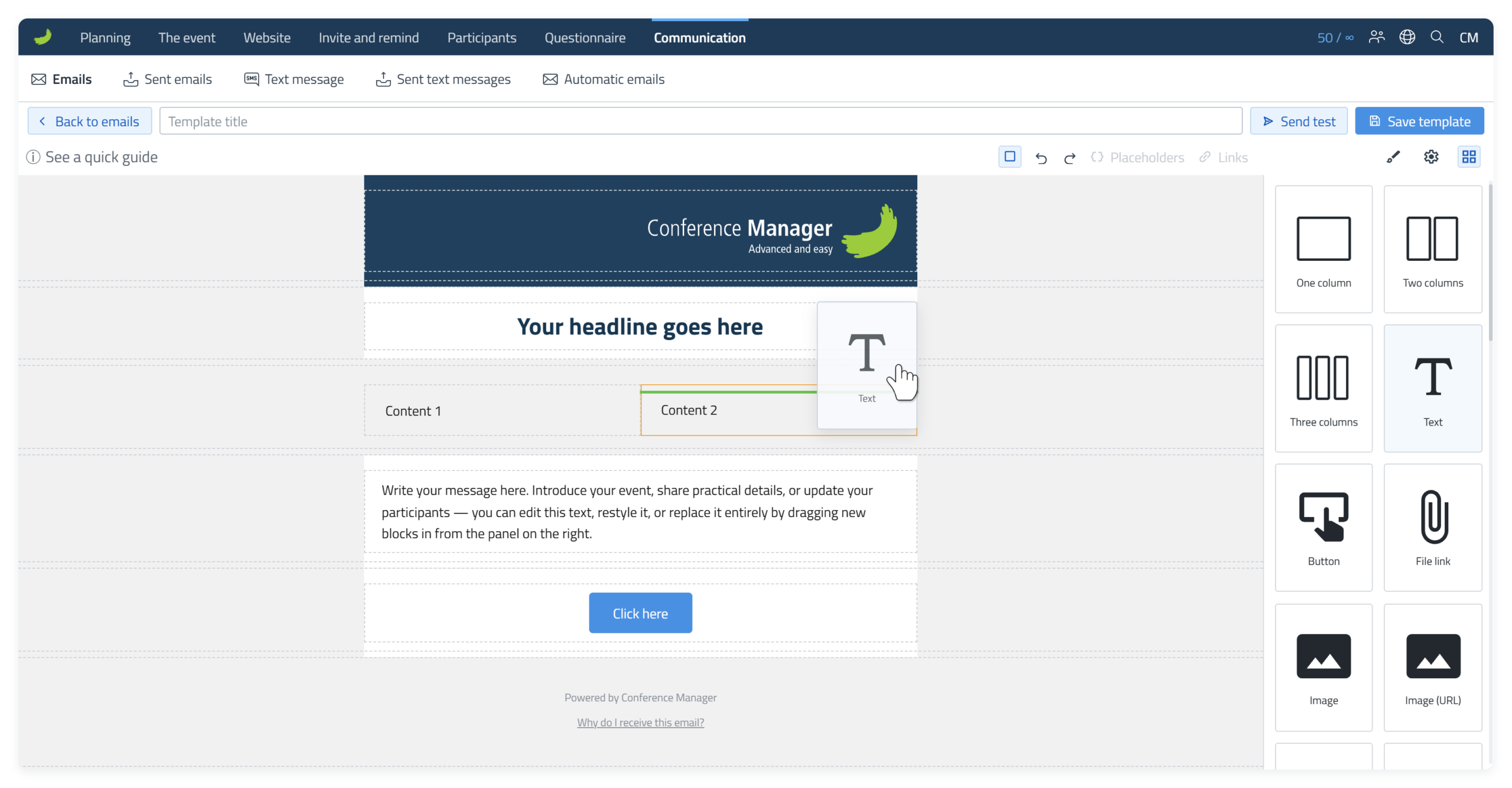
Content Blocks
The following Blocks can be added and edited in the email.
Text
Use a Text Block when you need an additional area for written content.
Click a Text element once to select the whole Text block and use Style Manager () to change its appearance. Double-click inside the text to edit the actual words.
1. Open the inline toolbar
Double-click inside the Text element to edit the text. An inline formatting toolbar appears above it.
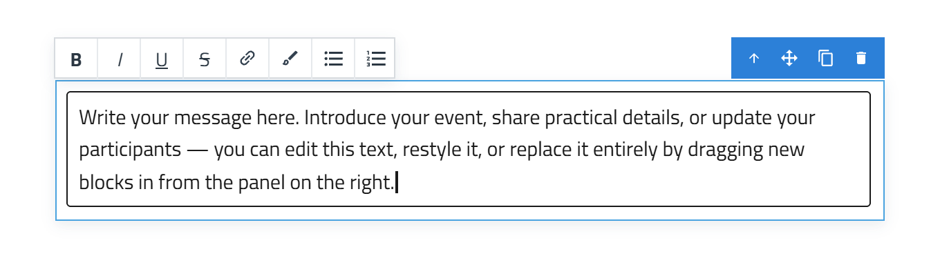
2. Use the inline toolbar for quick formatting
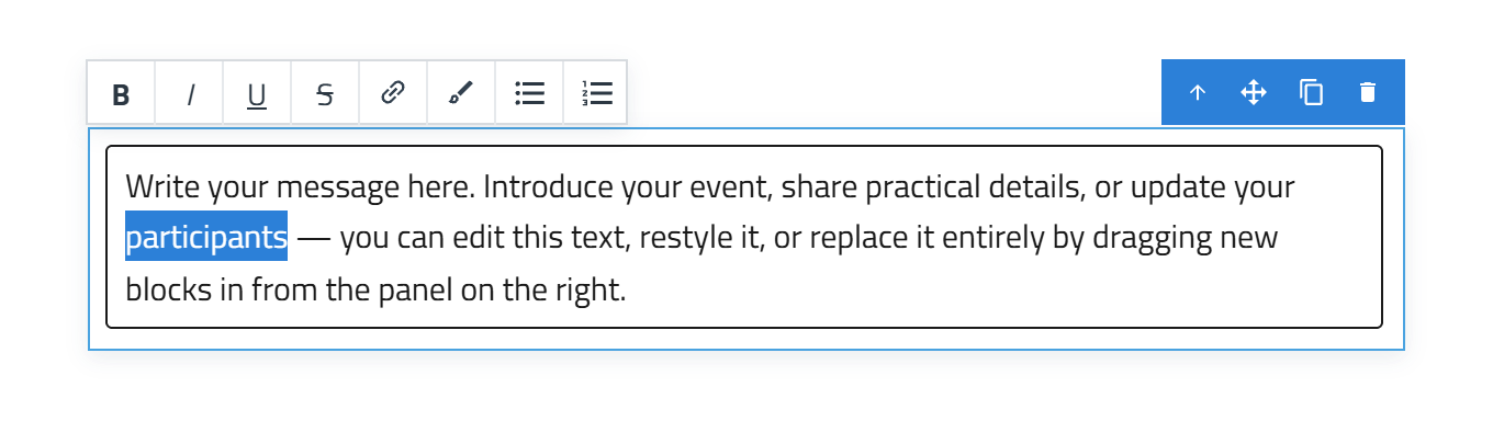
Select the word, phrase or part of the sentence you want to change. The inline toolbar gives you quick access to the most common text formatting options, including Bold, Italic, Underline, Strikethrough, links, bulleted lists and numbered lists.
To make a list, place the cursor in the text, or select the lines you want in the list, and choose the bulleted list or numbered list button in the inline toolbar. Press Enter to add the next item.
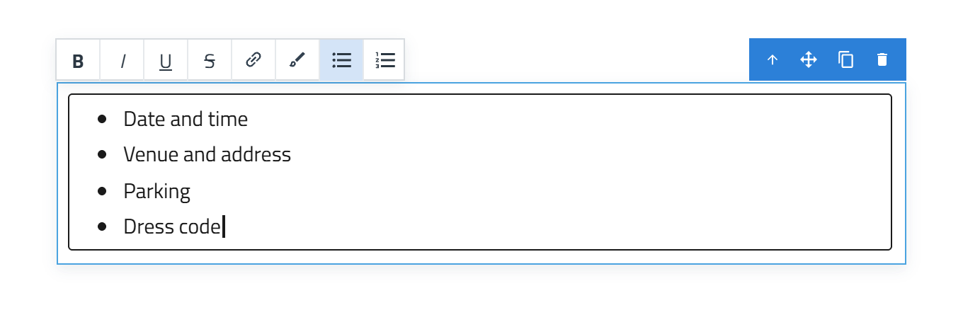
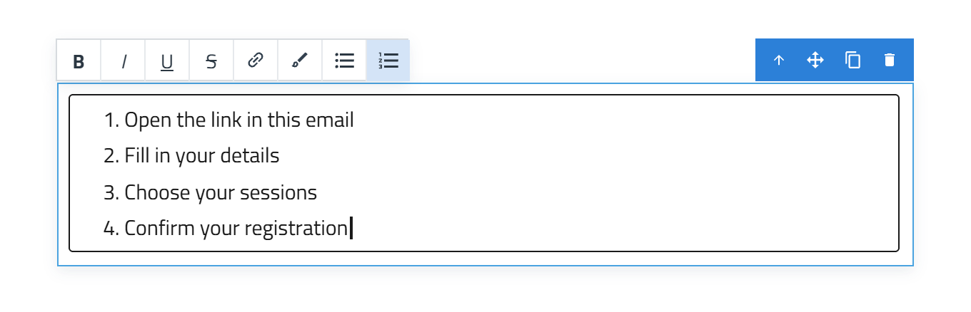
Most of these formatting options are also available in Style Manager (), where you have more control over the appearance of the text.
3. Use the brush for more styling options
If you want to use Style Manager () on only part of a Text element, select the relevant word or phrase and choose the brush icon.
This turns the selected text into its own Text element, so you can style it independently from the rest of the text.
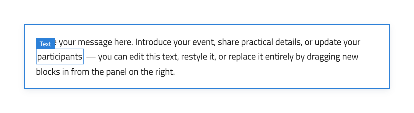
4. Style the new Text element
Select the new Text element and use Style Manager () for more advanced styling, such as font, font size, weight, colour, spacing, alignment and other typography settings.
Links are added from the inline toolbar rather than Style Manager. If you have used the brush to create a separate Text element, you can still edit that element later and add a link from the inline toolbar.
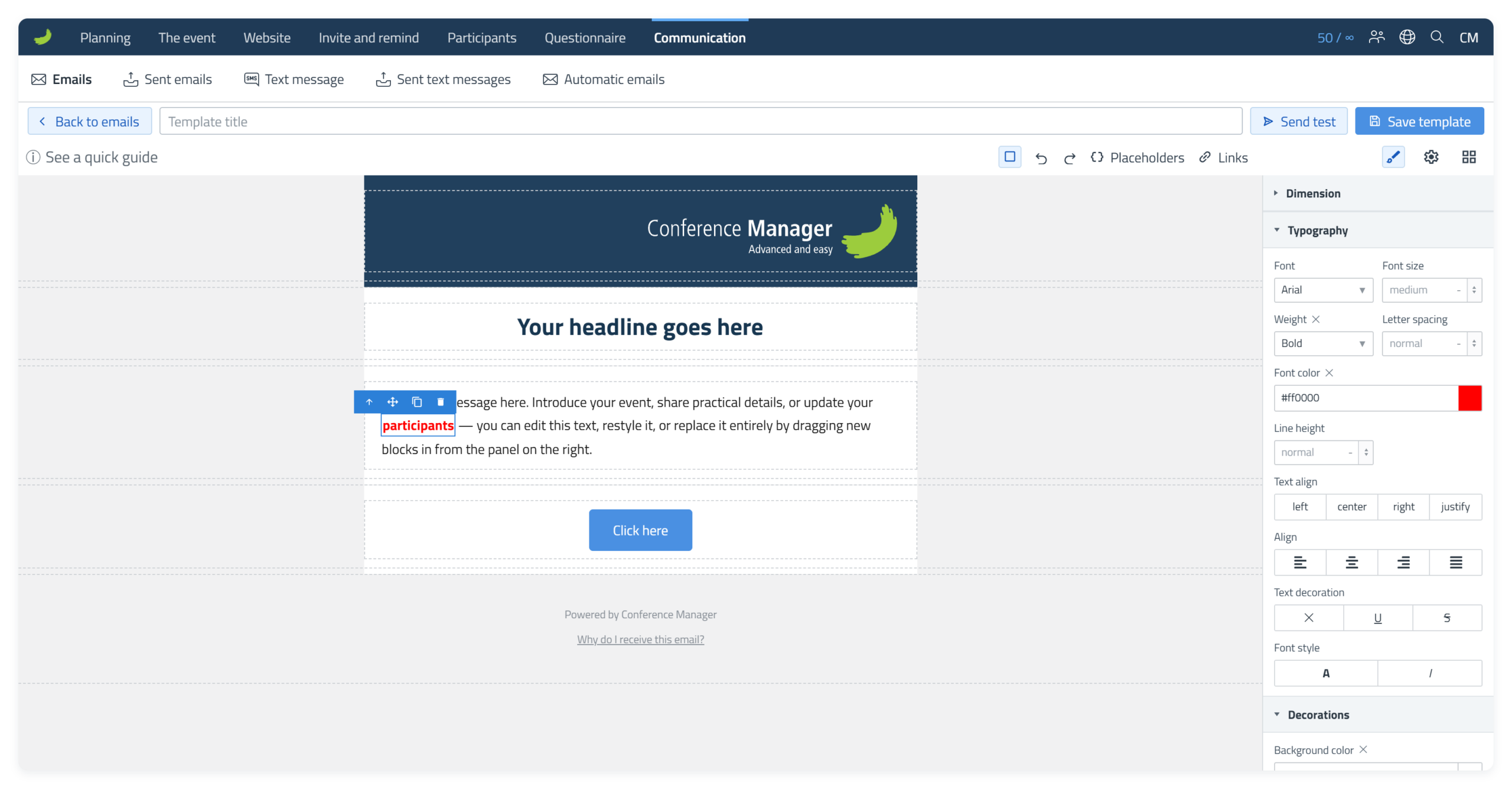
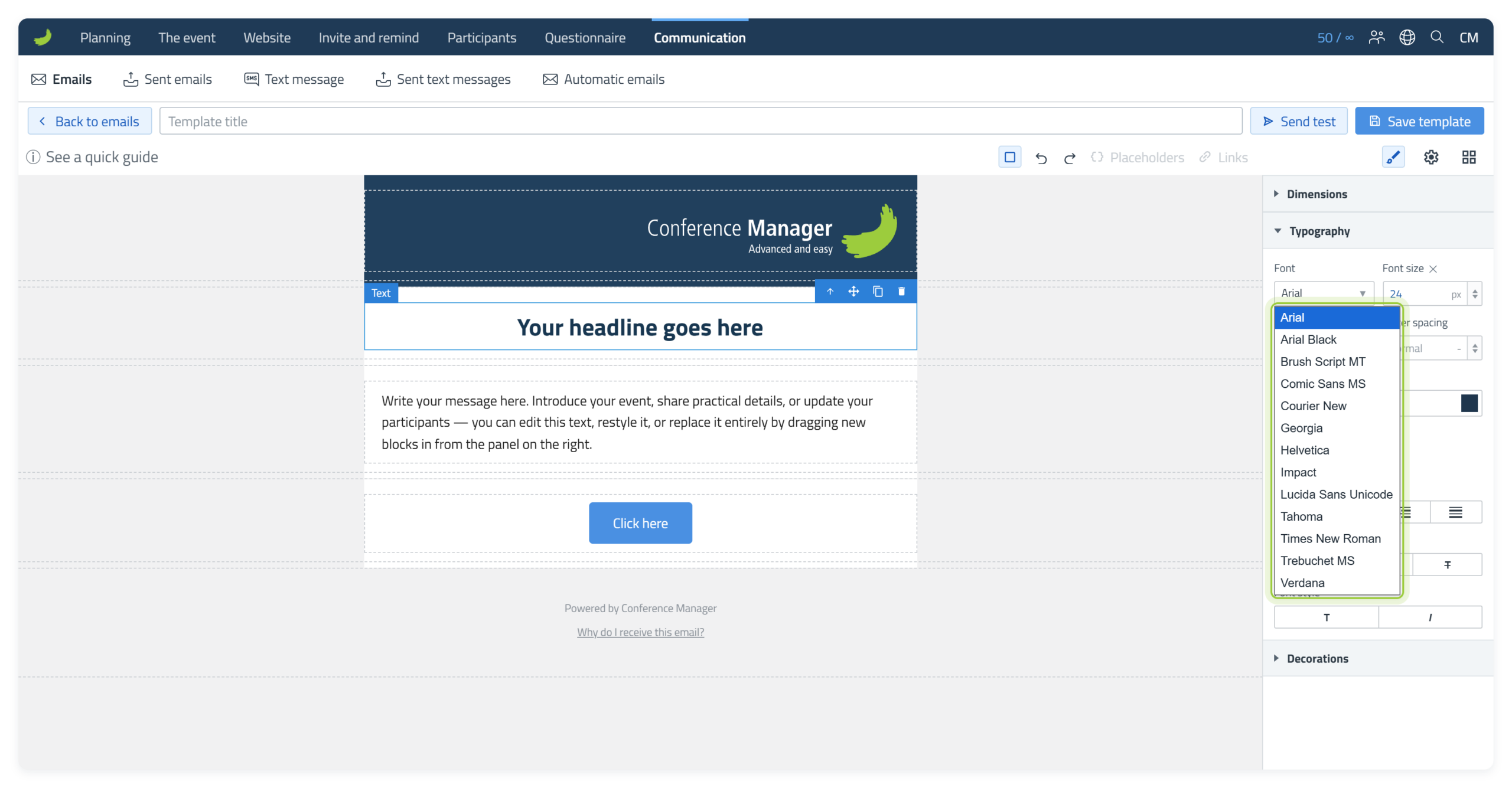
Fonts
Under Typography Font in Style Manager (), you can choose the font for the selected Text element. The list only contains fonts that are installed on almost all computers and phones, so the email looks the same for all recipients. Web fonts such as Montserrat are not available, because Gmail and Outlook do not show them and use a standard font instead.
Button
Use a Button for a regular link or call to action, for example when you want the recipient to open a webpage or continue to another destination.
Click the Button once to select the element. In Component settings (), use Link (URL) for a normal web address or Internal link for a destination provided by Conference Manager. Use Style Manager () to change the visual appearance of the button.
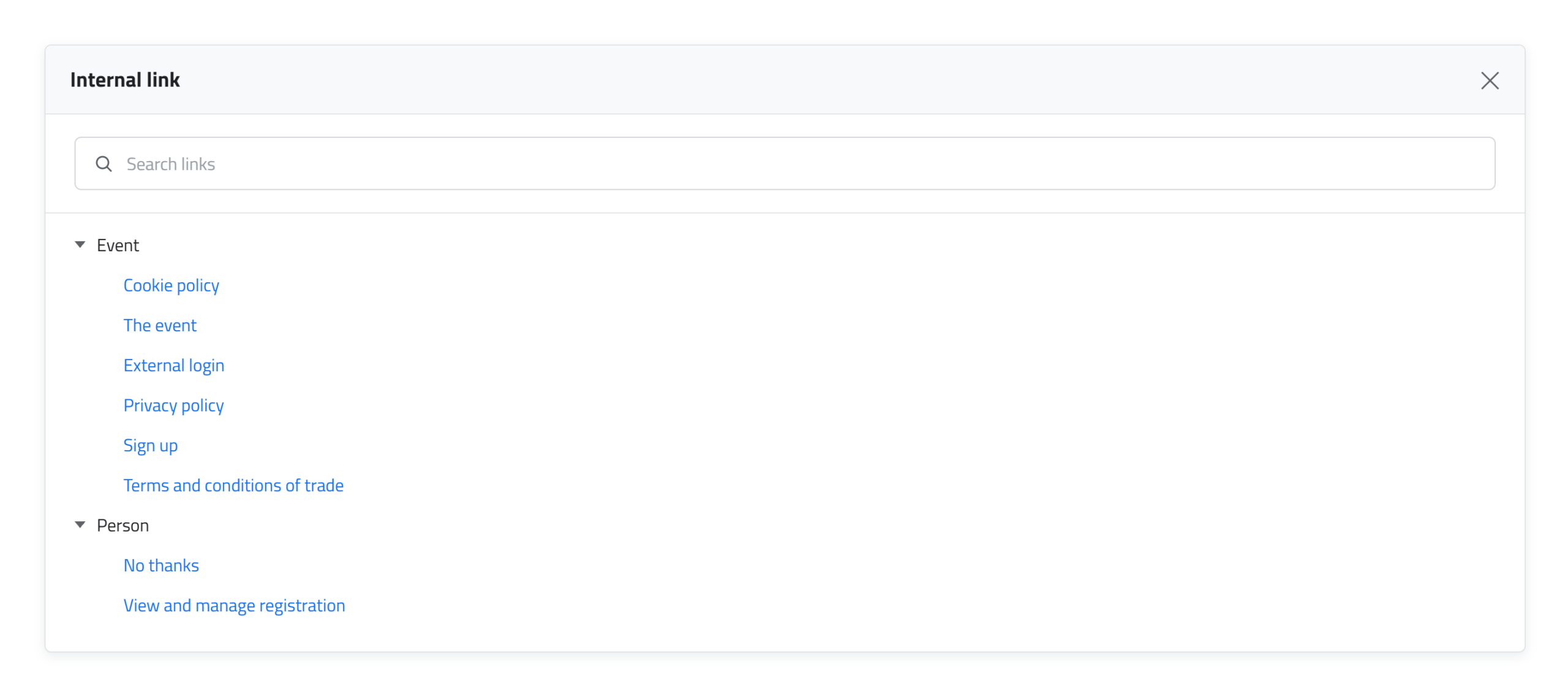
Use an Internal link
If you choose Internal link, a separate window opens where you can choose from the available Conference Manager links, for example View and manage registration.
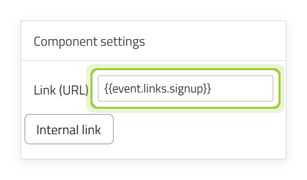
The placeholder in the link field
After you select an internal link, its placeholder is shown in the Link (URL) field. Do not delete the placeholder.
Edit the button text
Double-click on the button to edit the text shown on the button. You can use the inline toolbar in the same way as when editing Text.
Rounded corners
Select the button, open Style Manager () and enter a value under Decorations Corners (radius), for example 20. Each corner has its own field, so enter the value in all four fields to round all corners.
Rounded corners are not shown in all email clients, for example Outlook for Windows. There, the button has square corners.
File link
File link is also displayed as a button, but it is specifically intended to link to a file. Use it when the action should lead to a PDF, document or another file rather than a normal webpage.
In Component settings (), either enter the file URL or select Browse Media Library.
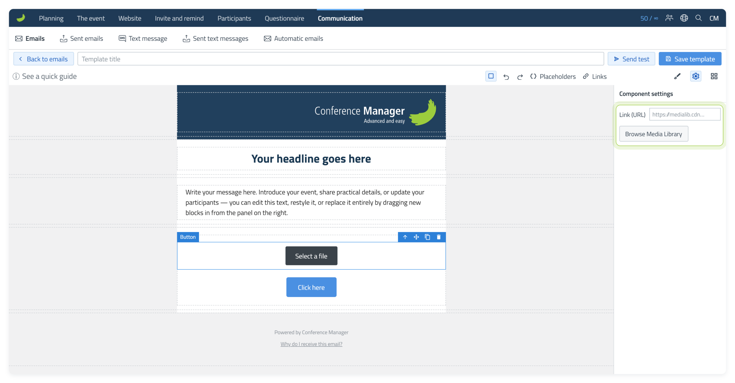
When you choose a file from the Media Library, the file name is automatically used as the button text. If you want different wording, double-click the button afterwards and edit the text.
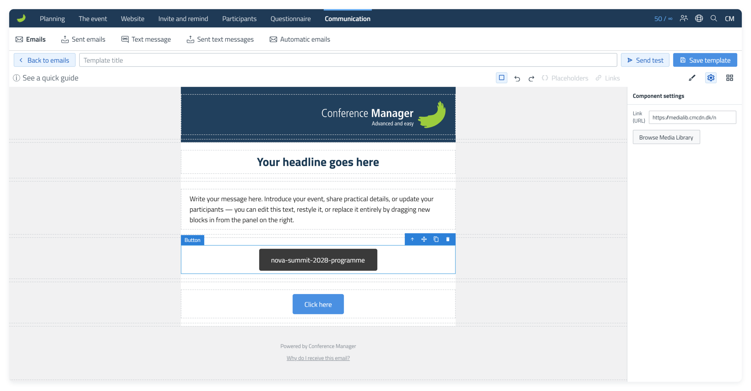
The File link is styled in the same way as a regular Button using Style Manager ().
Image
Replace an existing image
To replace an image that is already in the template, such as the Conference Manager logo, double-click the image to open the Media Library. Choose the replacement and select Insert.
Add a new image
Use an Image Block when the image should come from the Media Library. Drag the Block into a Column and the Media Library opens automatically.
When the Media Library opens, you can either select an image that is already in the library or upload a new one. Select Insert when you are ready to add the image to the email.
You can also close the Media Library without selecting an image. The Image element will remain in the email. To choose an image later, double-click the Image element to open the Media Library again.
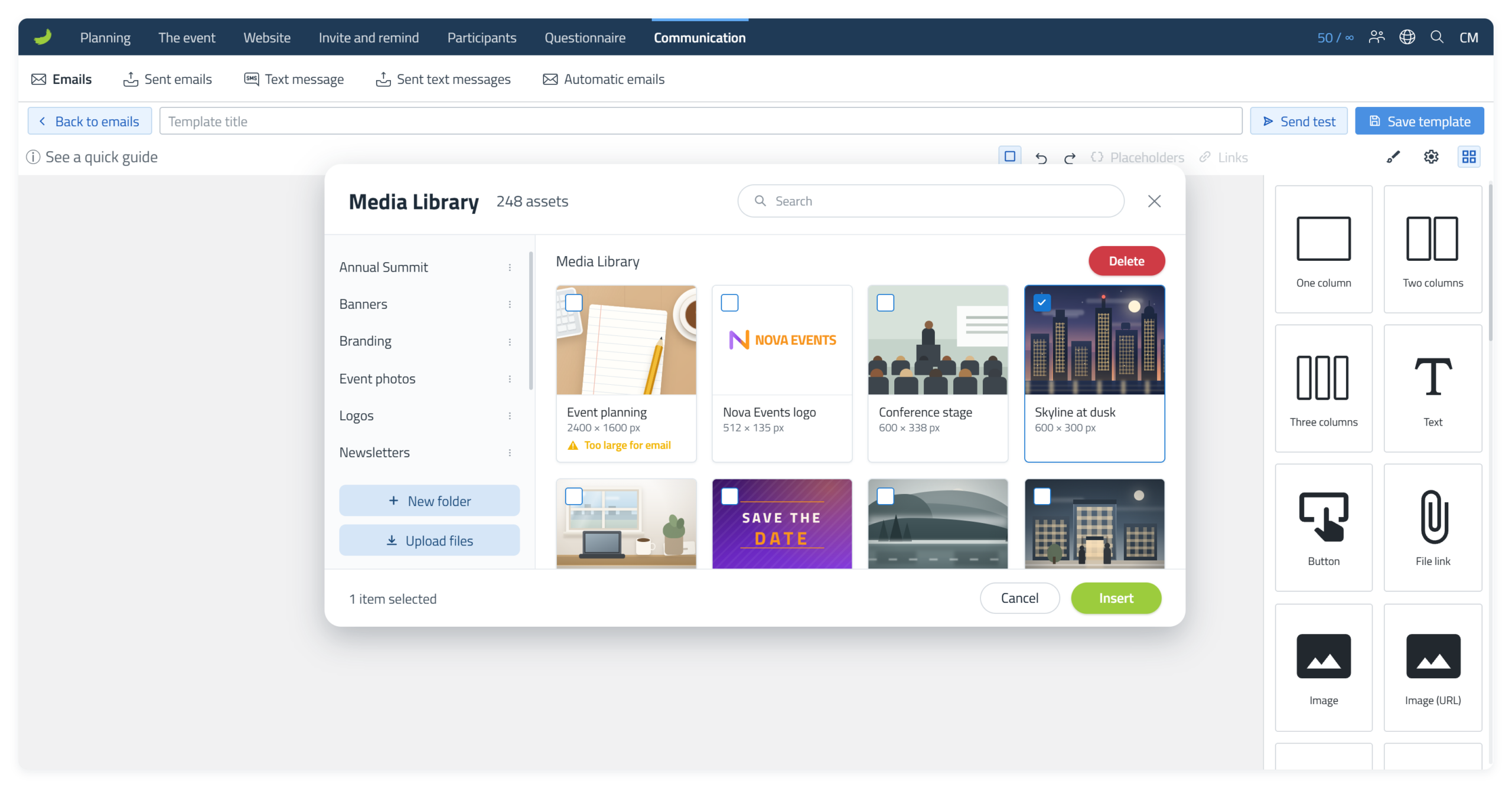
Once the image is in the email, select it and open Style Manager () to adjust its visual appearance. Under Dimension, use Width to resize the image. For example, choose px to set a specific pixel width, or % to set the width relative to the available space.
Where possible, use an image that is already close to the size it will be displayed at in the email. Avoid uploading a very large image only to scale it down significantly in the editor, as the email still has to load the larger image file.
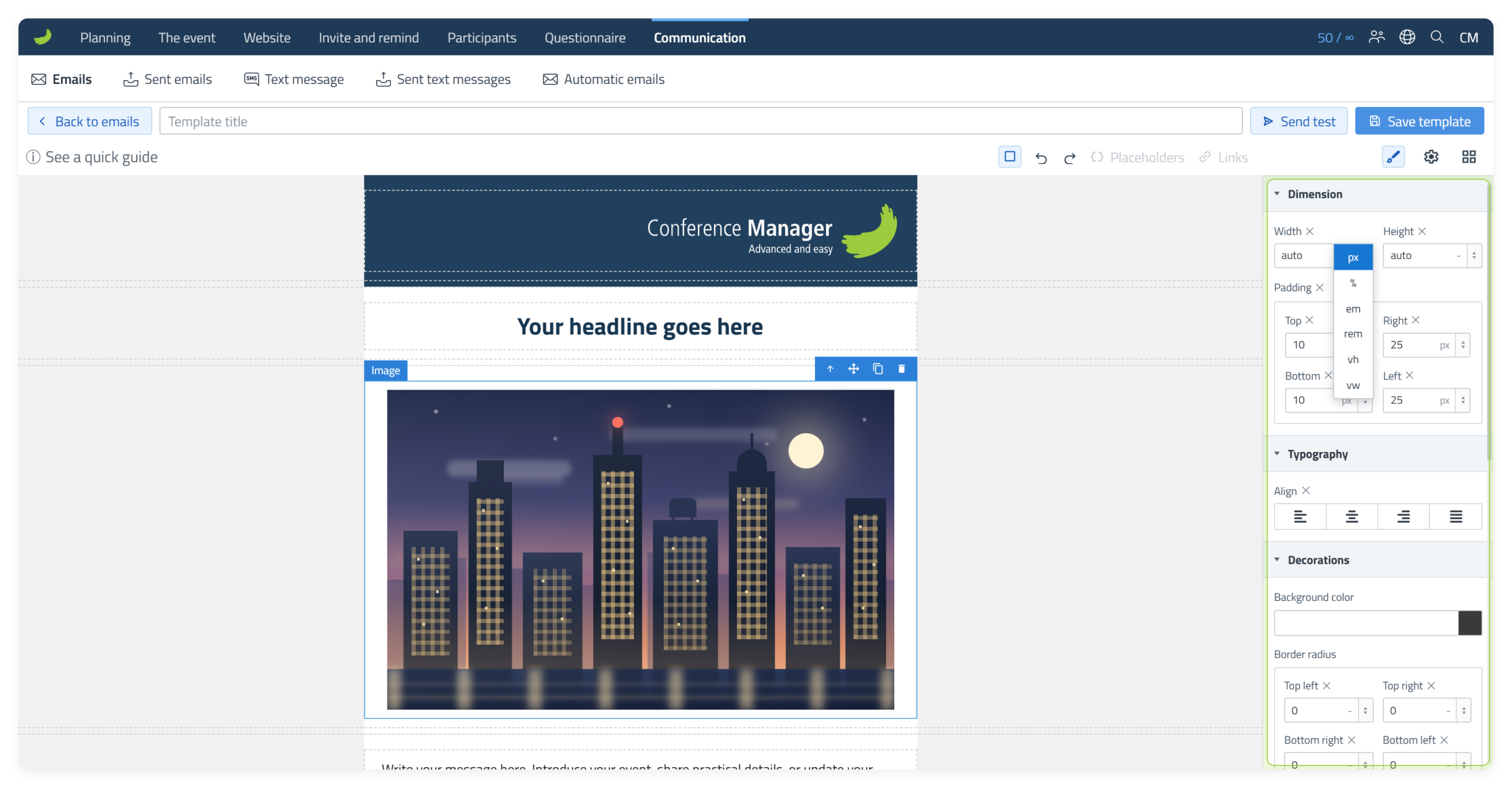
In Component settings (), you can add a normal Link (URL) or an Internal link. Adding a link makes the image clickable. When a recipient clicks or taps the image, the selected destination opens. Leave the link empty if the image should not be clickable. If you choose an Internal link, its placeholder appears in the Link (URL) field. Leave it in place.
You can also add Alt text. Alt text describes the image for screen readers and can also be shown if the image cannot be displayed. Keep it short and describe the purpose of the image. A purely decorative image can normally have empty Alt text.
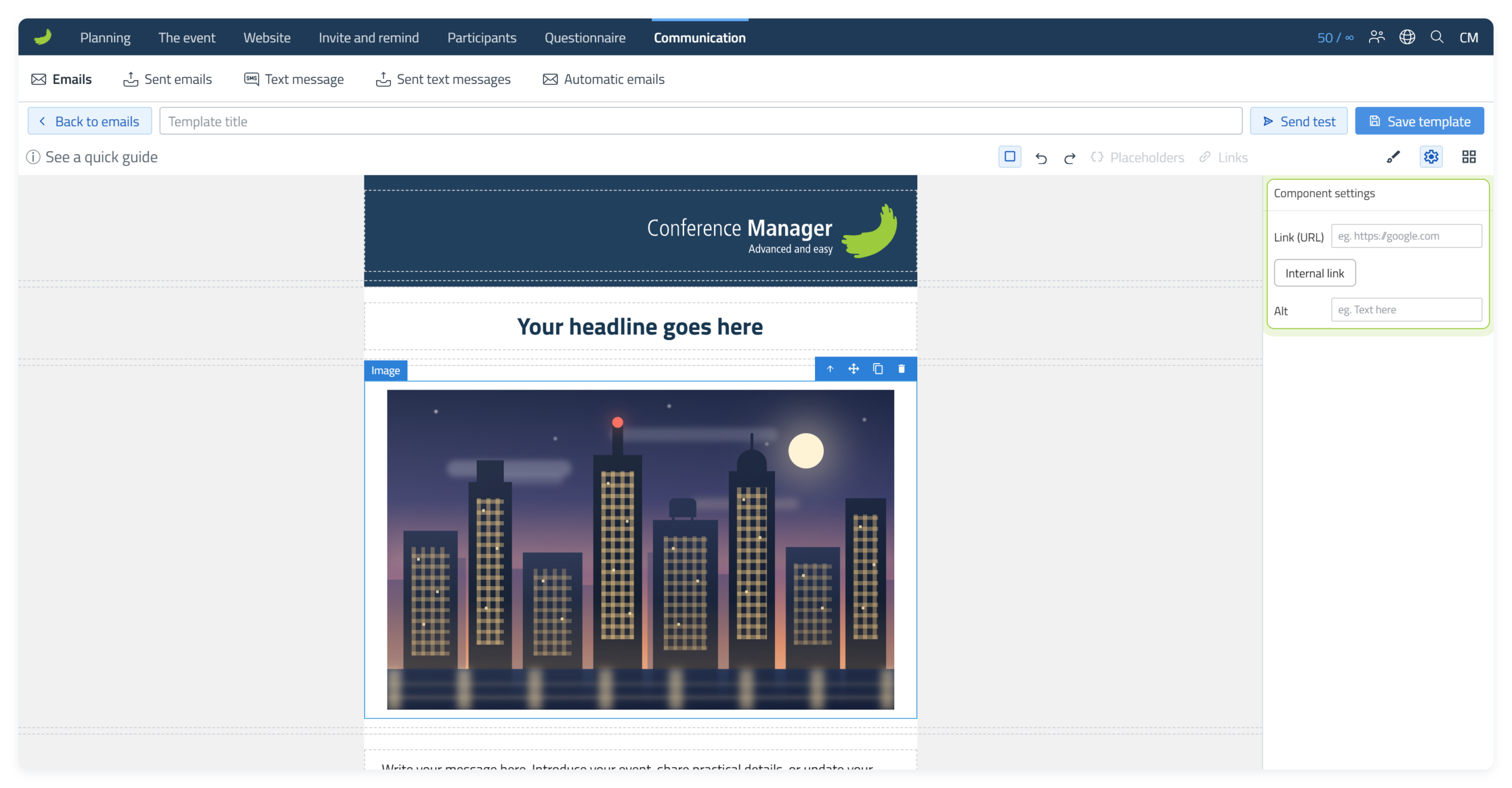
The Media Library shows the dimensions of each image. Very large images are marked Too large for email, which is a sign that the image should be resized or compressed before use.
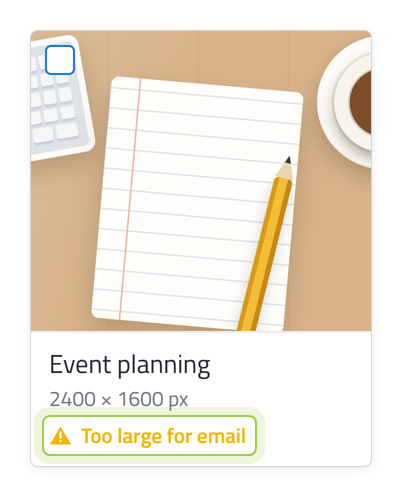
Yes. Too large for email is guidance only and does not stop you from inserting the image. It is about the file itself, not how large the image is shown. When you make the image smaller under Dimension → Width, the file does not get smaller, and the email is just as heavy. Large emails take longer to send, and some inboxes reject them completely.
So make the image roughly the size it will be shown at before you insert it. In the tool Check and optimise your images, you can choose Email editor, upload the image and download an optimised version.
As a practical guideline, use images close to the size they will actually be displayed at. For a 600 px wide email, this is typically up to around 600 px for a full-width image, 300 px in a two-column layout and 200 px in a three-column layout. Allow for slightly smaller widths if the Columns use padding or spacing.
If you want an image to replace the standard dark-blue header area with approximately the same proportions, use around 600 × 125 px.
Keep file sizes as small as practical. As a general guideline, keep individual images below about 200 KB where possible and aim for a combined image size of around 1 MB or less.
Tools for your email images
Image (URL)
Use Image (URL) when the image is hosted elsewhere and you want to use its direct image address instead of selecting a file from the Media Library.
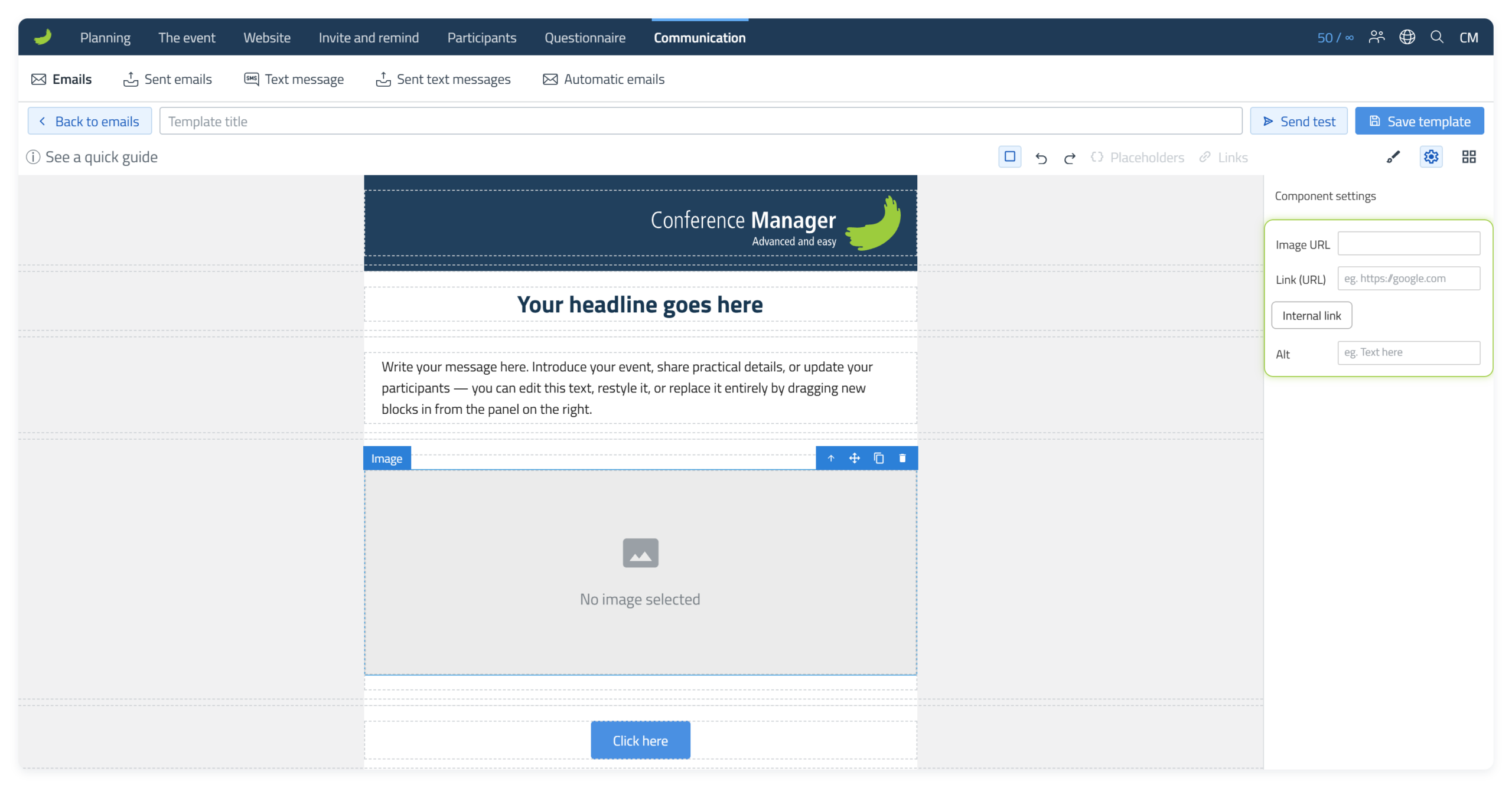
Drag the Block into a Column, select it and enter the Image URL in Component settings (). The Image URL determines which image is displayed.
If you want the image to be clickable, add a Link (URL) or choose an Internal link. When a recipient clicks or taps the image, that destination opens. In other words, Image URL controls the image itself, while Link (URL) or Internal link controls where the image leads. If you choose an Internal link, its placeholder appears in the Link (URL) field. Leave it in place. You can also enter Alt text.
Divider
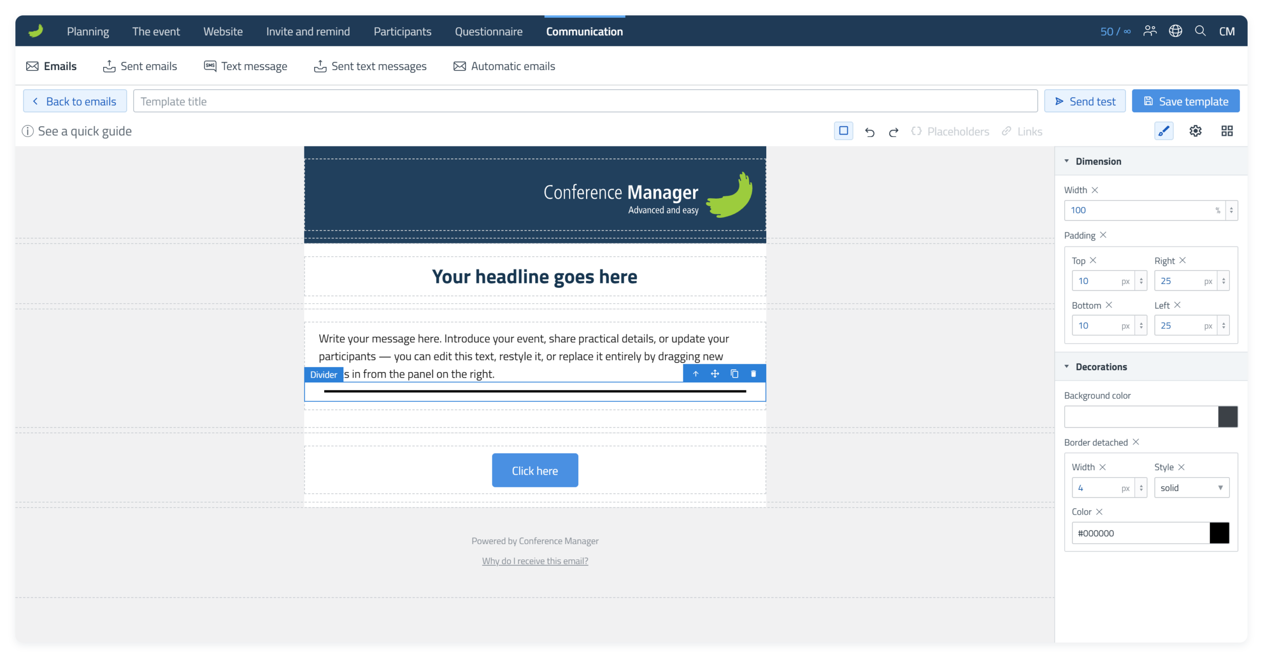
Use a Divider when you want a visible line between parts of the email. Select the Divider and use Style Manager () to adjust its width and spacing under Dimension and the line itself under Decorations.
Spacer
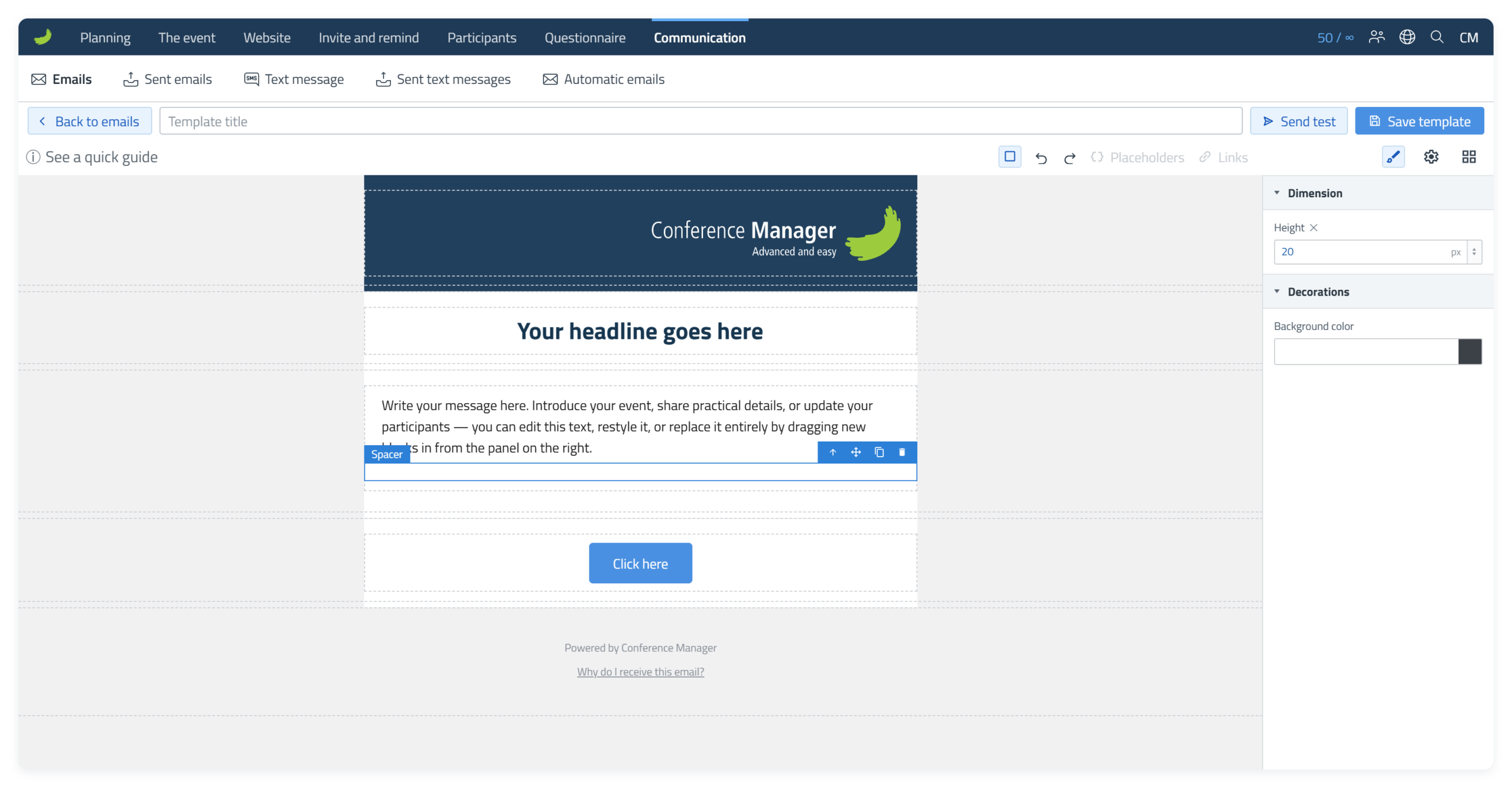
Use a Spacer when you need extra vertical space without adding visible content. Select the Spacer and use Style Manager () to adjust its Height. A background colour can also be applied if needed.
Social elements
Social elements let you add clickable icons that link to social media profiles, social media pages or other websites.
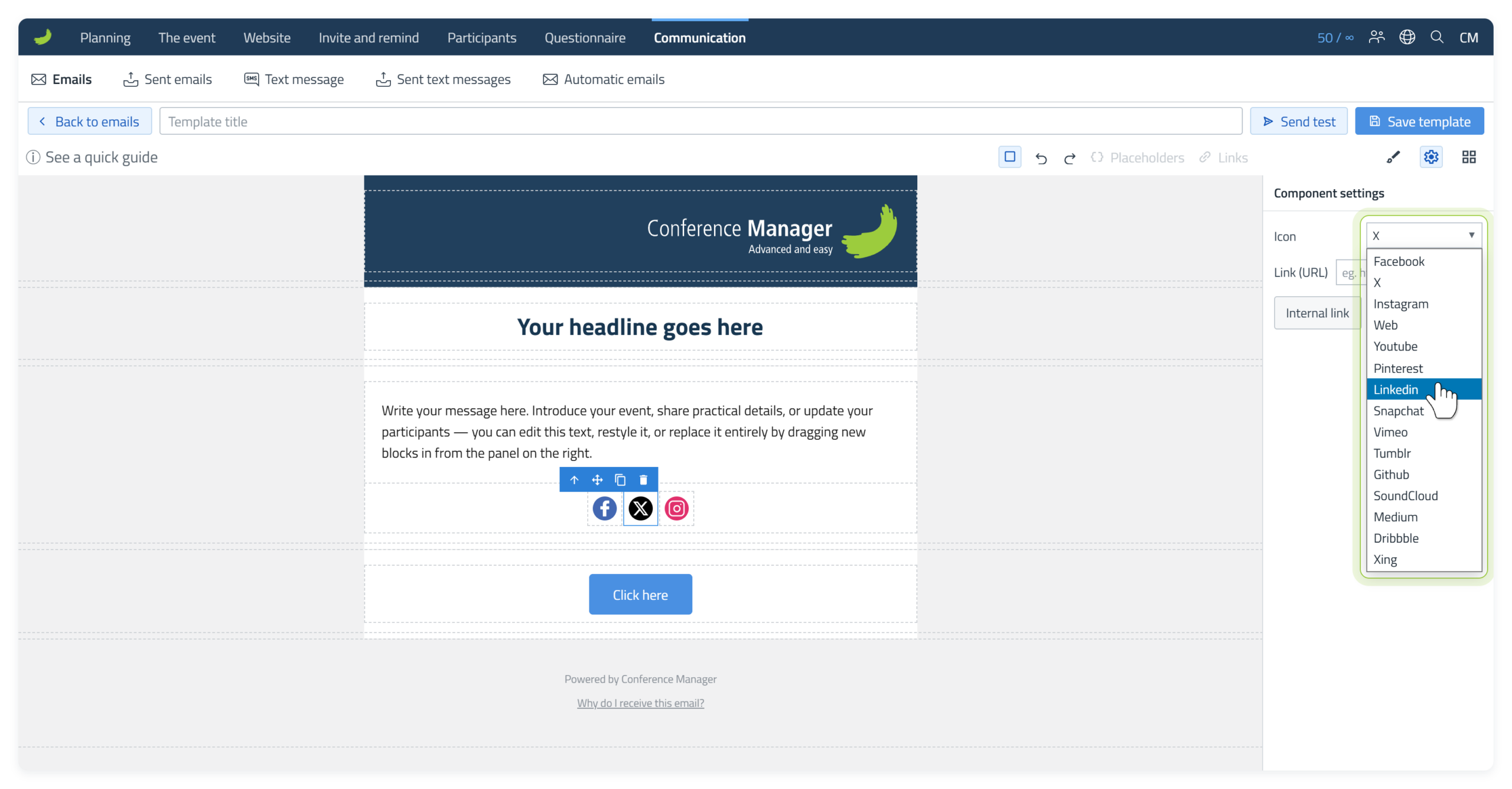
The available platform options include common social networks as well as a Web option.

You can add a Social group when you want several icons together, or use a single Social element if you only need one icon. A Social group simply acts as a container for the individual Social elements.
For example, drag a Social group into a Column if you want to start with several icons together. You can then add, remove or edit the individual Social elements in the group.
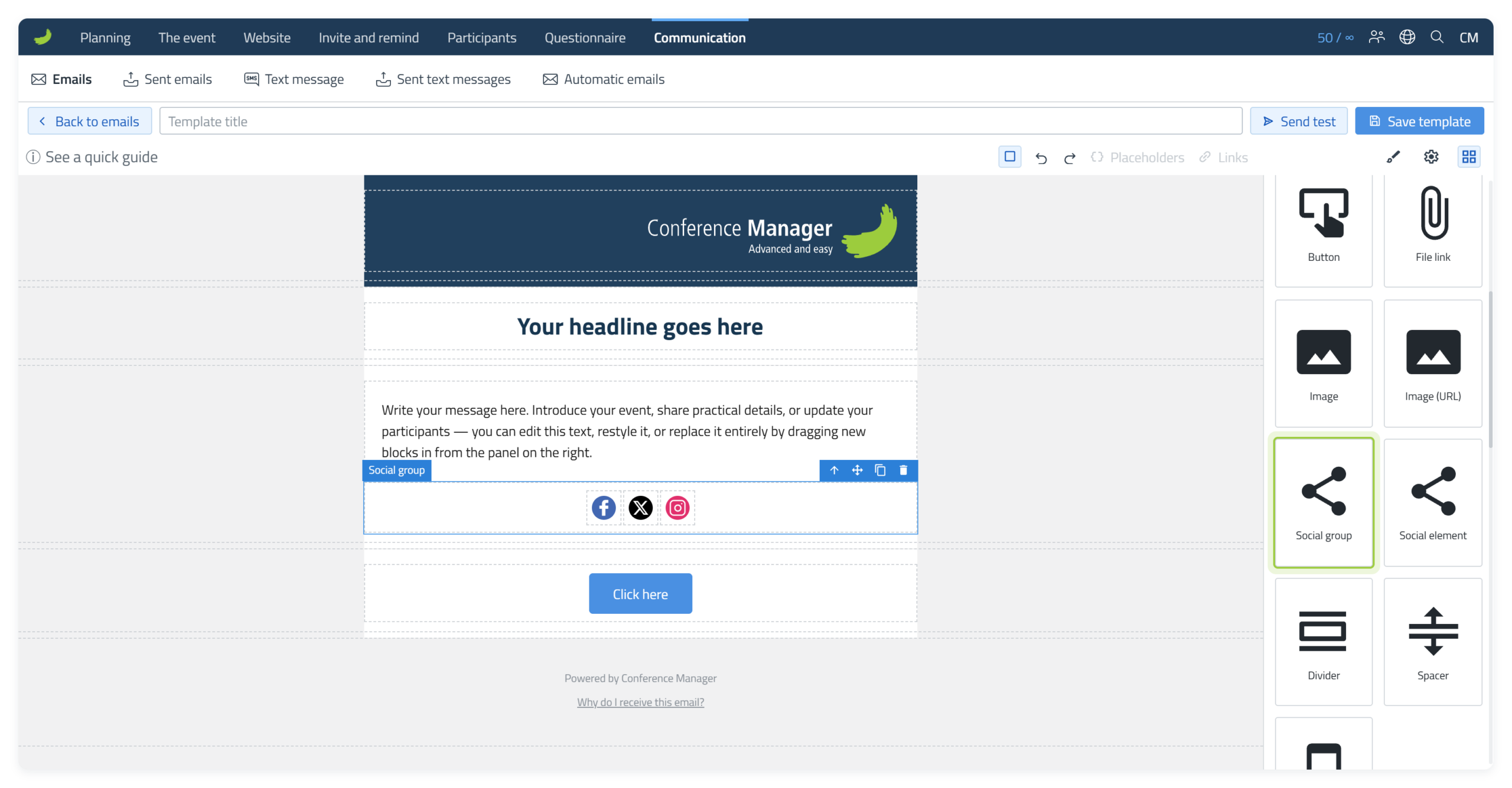
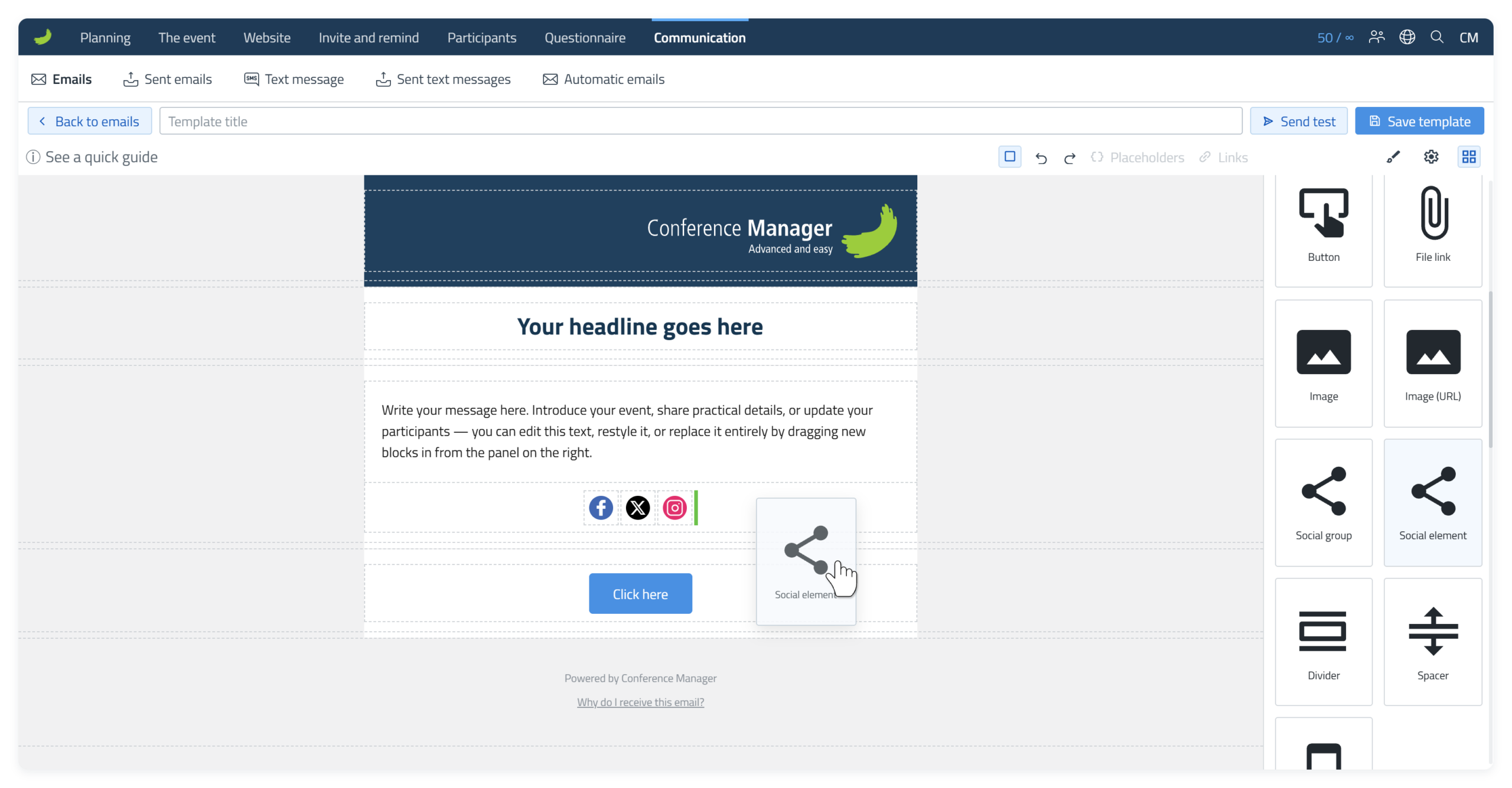
To add another icon, drag a Social element to the position where you want it. A small green insertion line shows a valid drop position. When the green line appears, the element can be dropped there.
Select the Social element and choose the icon or platform in Component settings ().
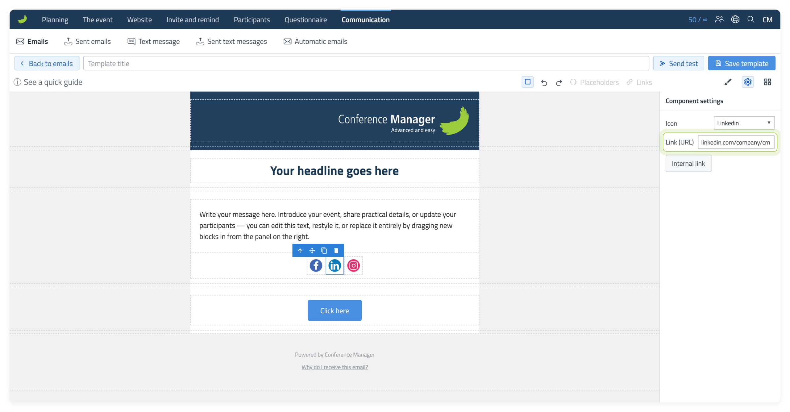
Enter the page or website the icon should open in Link (URL).
App banner
Use App banner to promote the CM Events app directly in the email. Drag the App banner Block into a Column and select it to adjust the element.
If your organisation has a custom CM Events app, the banner uses your app name and app preview image. Otherwise, it shows the standard CM Events app. The banner also includes links to the relevant app stores, so recipients can continue directly to the app.
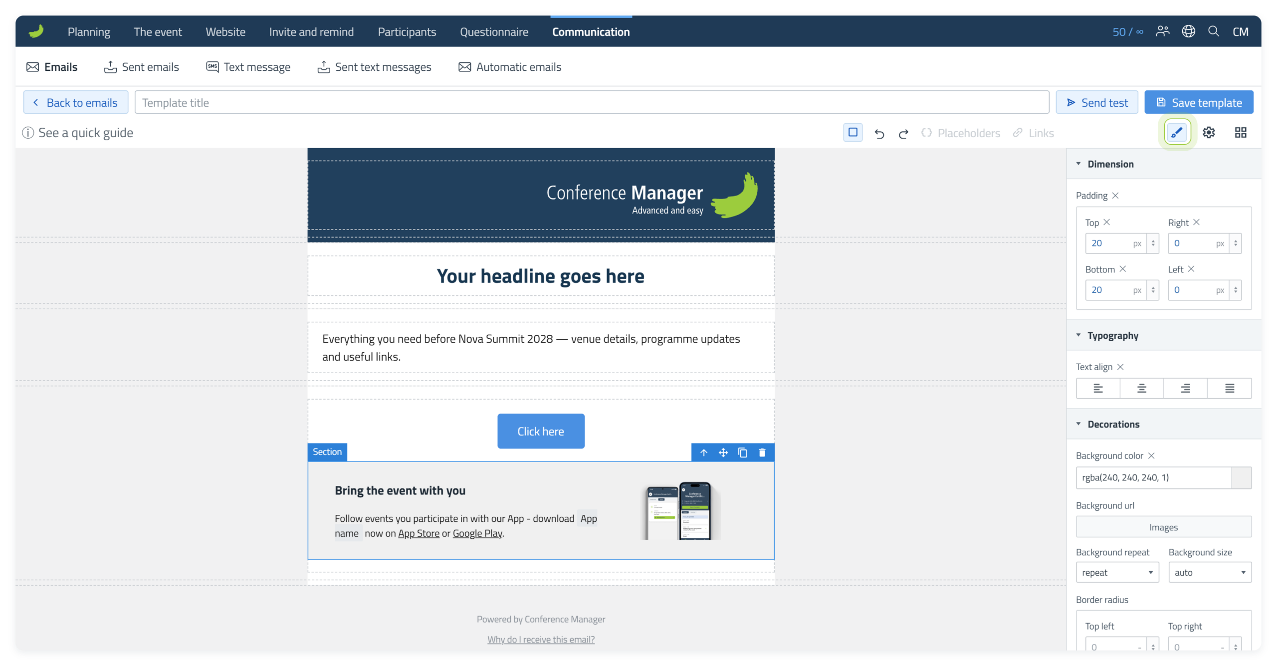
Wallet banner
Use Wallet banner to remind participants that they can save their ticket in Apple Wallet or Google Wallet. Drag the Wallet banner Block into a Column.
The text in the banner is fixed and cannot be edited. The button opens the same page as the link View and manage registration. From their overview there, participants can download the wallet pass.
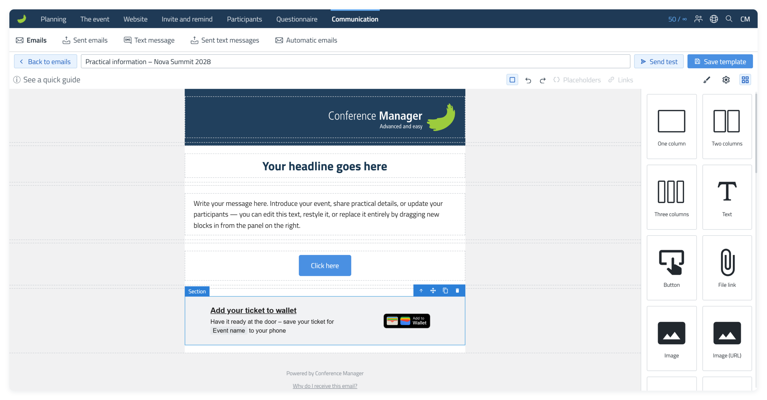
Wallet banner is only available when Wallet Pass is turned on under The event Confirmation and ticket Wallet Pass. It is not available in invitations under Invite and remind, because the recipients have not registered yet.
Add personalised content and internal links
Use Placeholders and Links when a Text element should contain participant-specific information or an internal link related to the event or recipient.
Placeholders ( ) and Links (
 ) in the top toolbar are only available while you are editing a Text element. Double-click inside the text first. Personalised information and person-specific links are based on the participant/invitee receiving the email.
Insert a placeholder
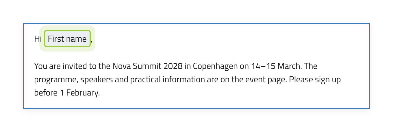
Place the text cursor where the personalised value should appear, select Placeholders () and choose the required value. For example, select Person First name to insert the participant’s first name.
Under Event, you find placeholders such as Event Name, Start date and Start Time. They are filled in automatically with the details of the event.
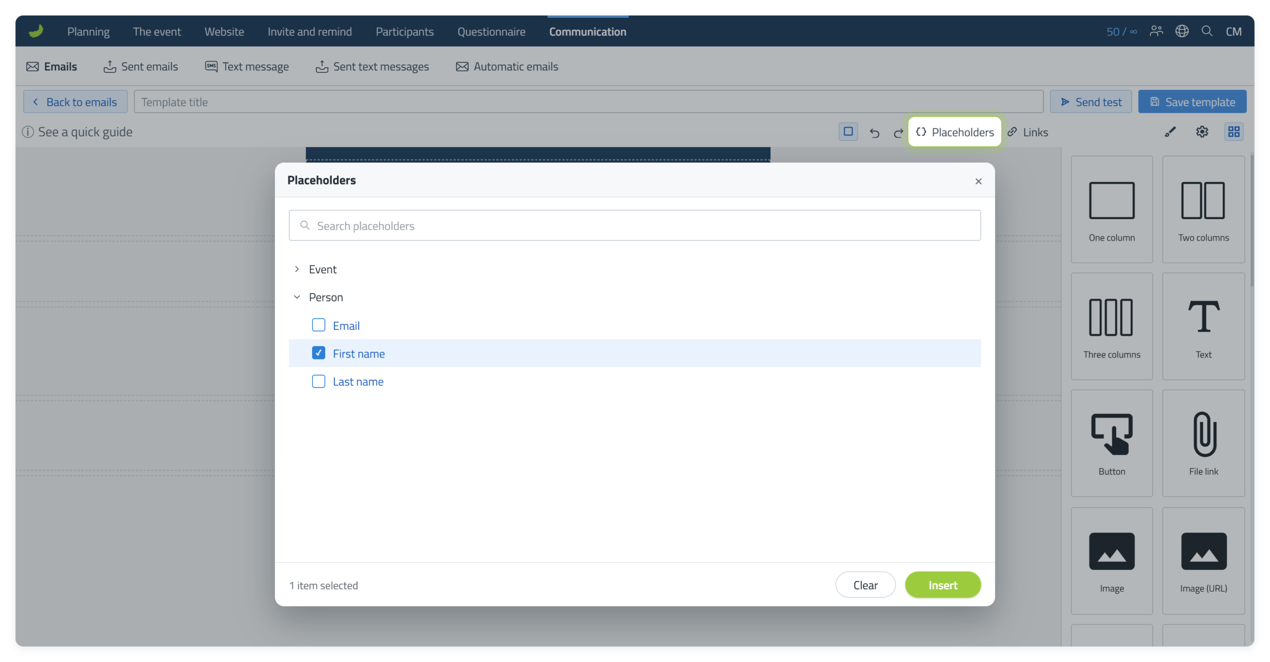
Once selected, the placeholder is inserted at the cursor position in the text and is shown as a code-like placeholder in the editor. In the sent email, the placeholder is replaced by the relevant participant or event information for each recipient.
Add an internal link to text
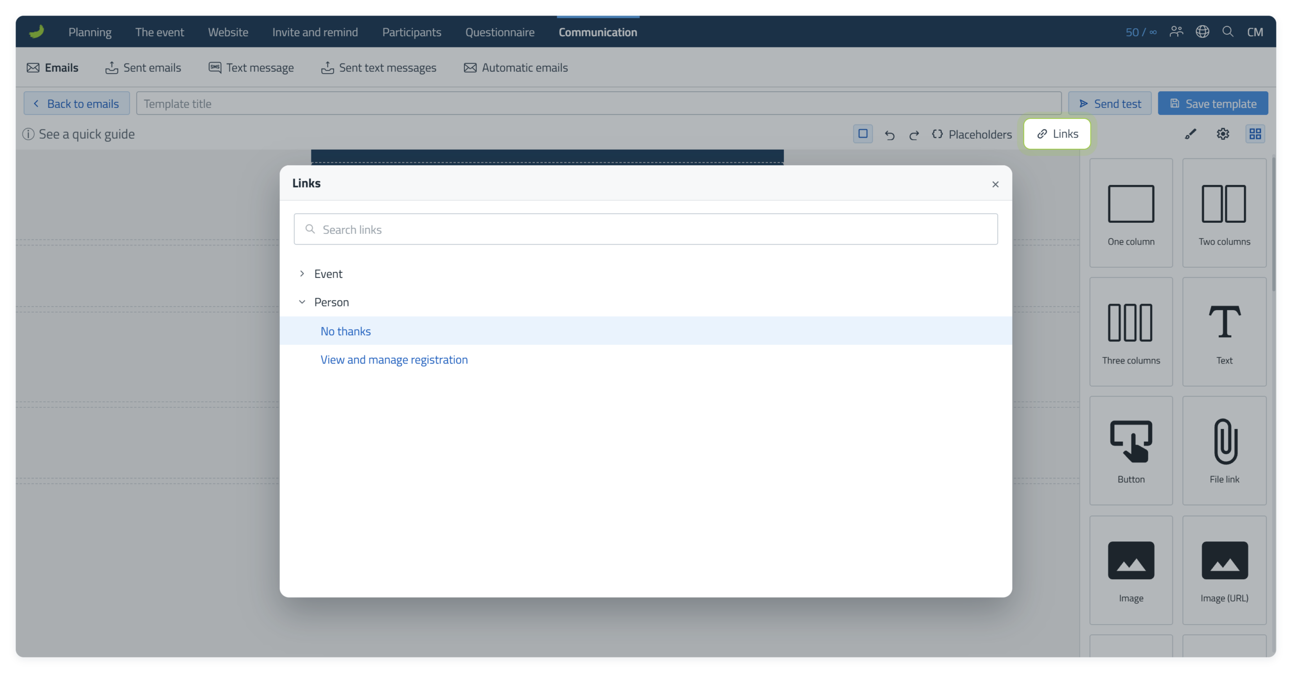
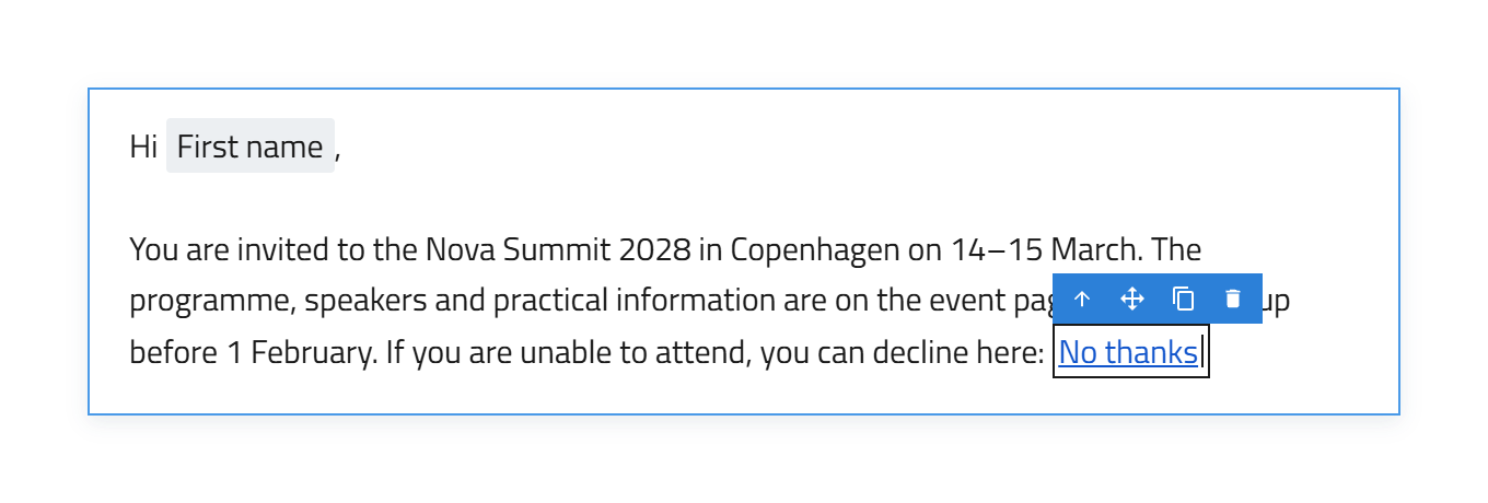
While editing Text, select Links () in the toolbar. Links are grouped by context, such as Event and Person.
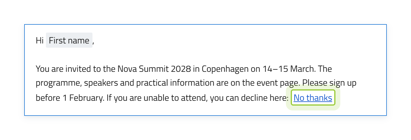
When you insert a link, it is shown in the text with the name of the link, for example “View and manage registration”. If you want a different text, double-click the link, delete the text and type your own.
Internal links on buttons and images
Buttons and images do not use the toolbar Links menu. Select the Button or image and use Internal link in Component settings ().
After you select the internal link, its placeholder is shown in the link field. Leave the placeholder in the field and do not delete it.
Links in invitations: personalised or non-personalised
In invitations under Invite and remind Invitations, the Internal link window has an extra group, Invite.
- The links under Invite are marked (personalised). Each recipient gets their own link, linked to their invitation.
- The links under Event marked (non-personalised) are the same for everyone and are not linked to the recipient.
- No thanks under Person lets the recipient decline the invitation.
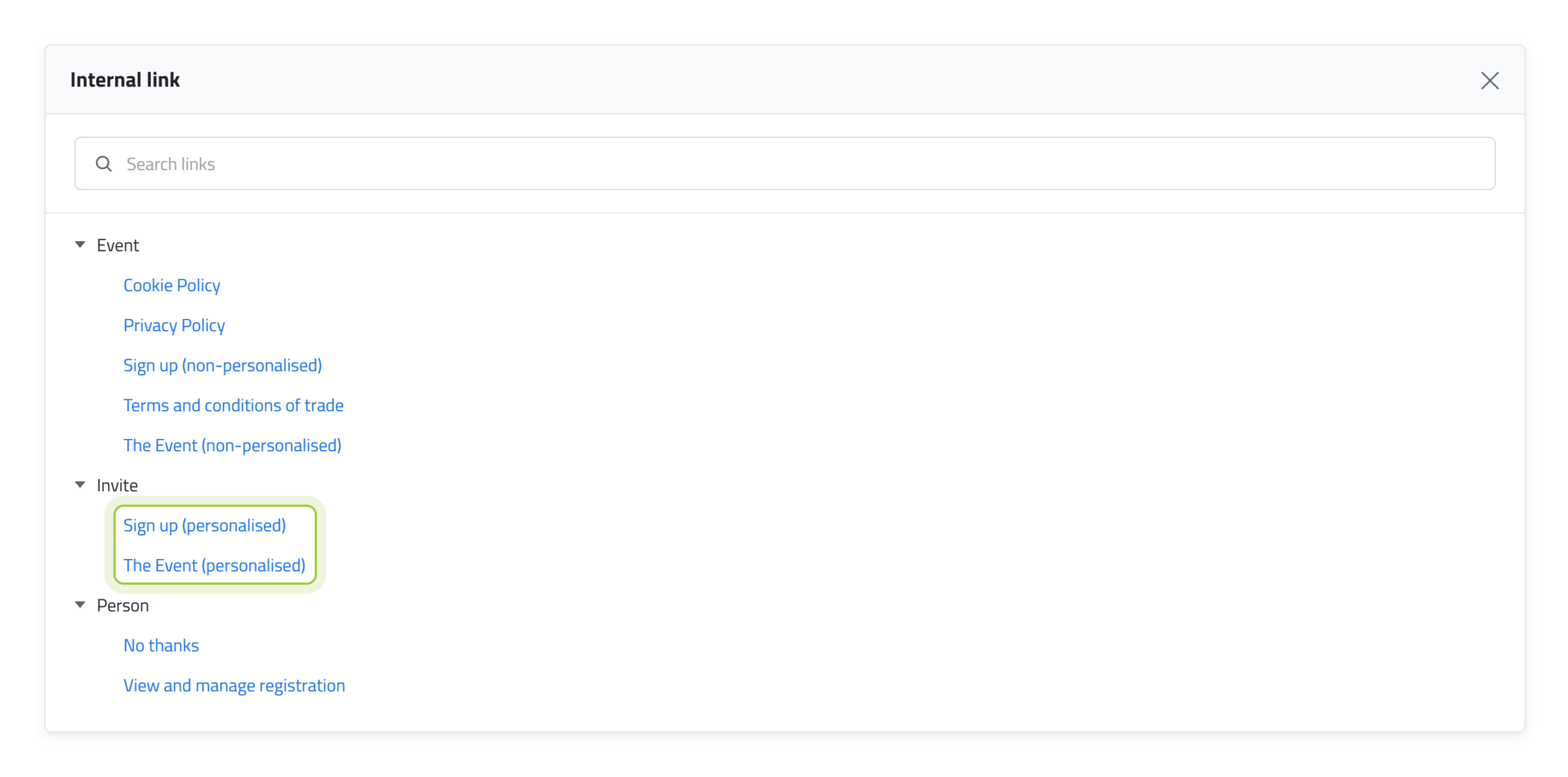
In an invitation, always use a link under Invite: Sign up (personalised) goes straight to the sign-up, and The Event (personalised) goes to the event website, where the recipient can continue to the sign-up. Both links are personal.
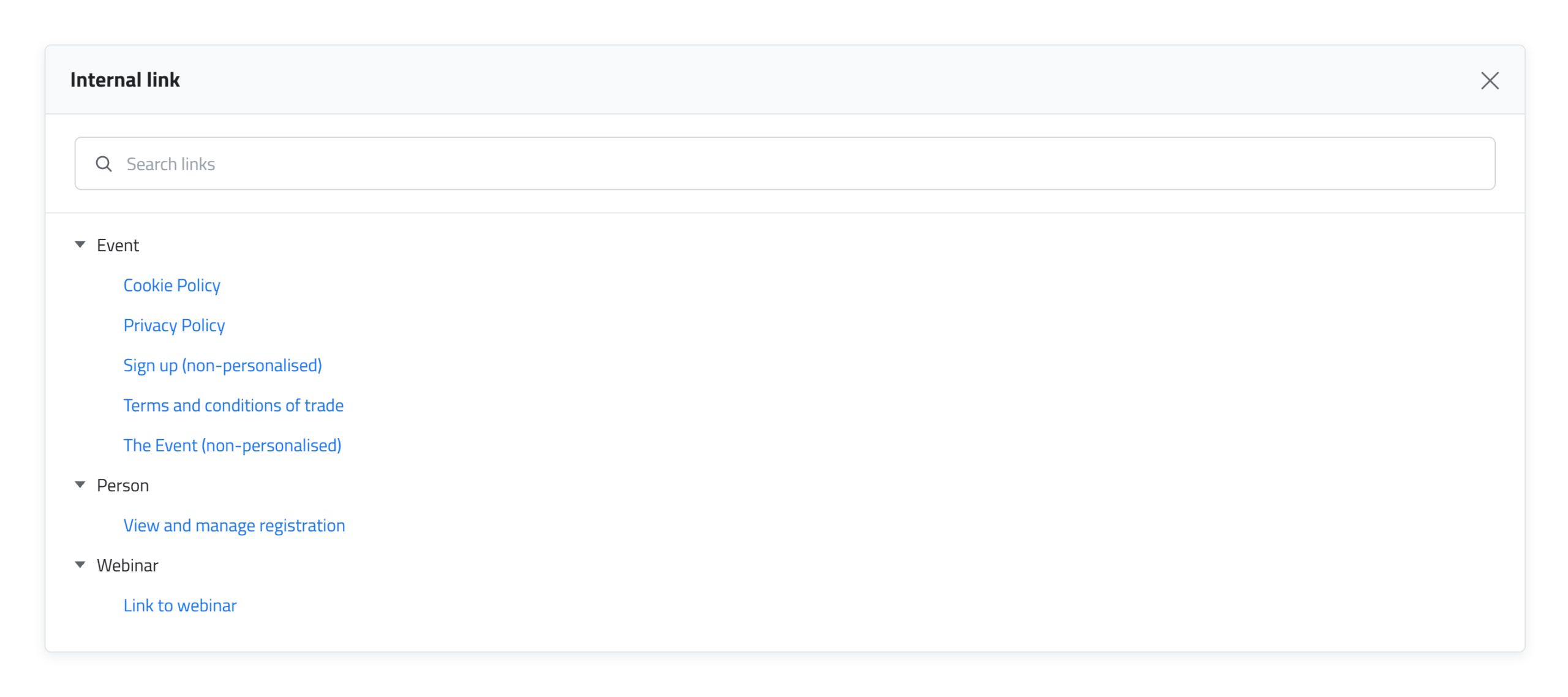
In other emails, for example under Communication, there is no Invite group. There, only the non-personalised links under Event are available.
Test and save
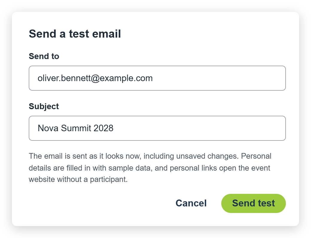
Select Send test to send the email to yourself before you send it to participants. The email is sent as it looks now, including changes you have not saved yet. Personal links open the event website without a participant.
Send to is filled in with the email address you are logged in with. You can change it to another address.
Subject is filled in with the subject you have given the email. You can change it for the test.
Select Send test.
In the editor, a placeholder shows the name of the placeholder field, for example First name and Last name.
In the test email in your inbox, it is replaced with sample data, for example John Doe.
Use Send test to check the layout in your own inbox. To check placeholders and personal links with real data, add yourself as a participant and send a real email to yourself through the normal email flow. Check how it looks in the email clients and devices that matter for your recipients.
Template title and email subject
Give the template a clear title before you select Save template. The template title is also used as the email subject when you start a Dispatch with that template.
You can always change the subject for the specific email in the Email step of the Dispatch flow before sending. Saved templates are stored under Templates with email editor in the relevant template overview.
Send the email
When the email is ready, continue through Dispatch. The flow has three steps: Email, Recipients and Schedule.
1. Email
Review the email before you continue. The Subject is prefilled with the template title, but you can change it for this specific Dispatch.
An alternative sender name is the name recipients see as the sender of the email. If you want to use one, choose it in this step together with the subject.
2. Recipients
Select who should receive the email. You can use the available filters to narrow the recipient list, and the number of recipients updates before you continue.
3. Schedule
Choose whether the email should be sent Now or Later. Review the choice before you complete the dispatch.
Confirmation emails
Confirmation emails can use either plain text or the email editor. The sending flow is different because a confirmation email is sent automatically when the relevant confirmation is triggered.
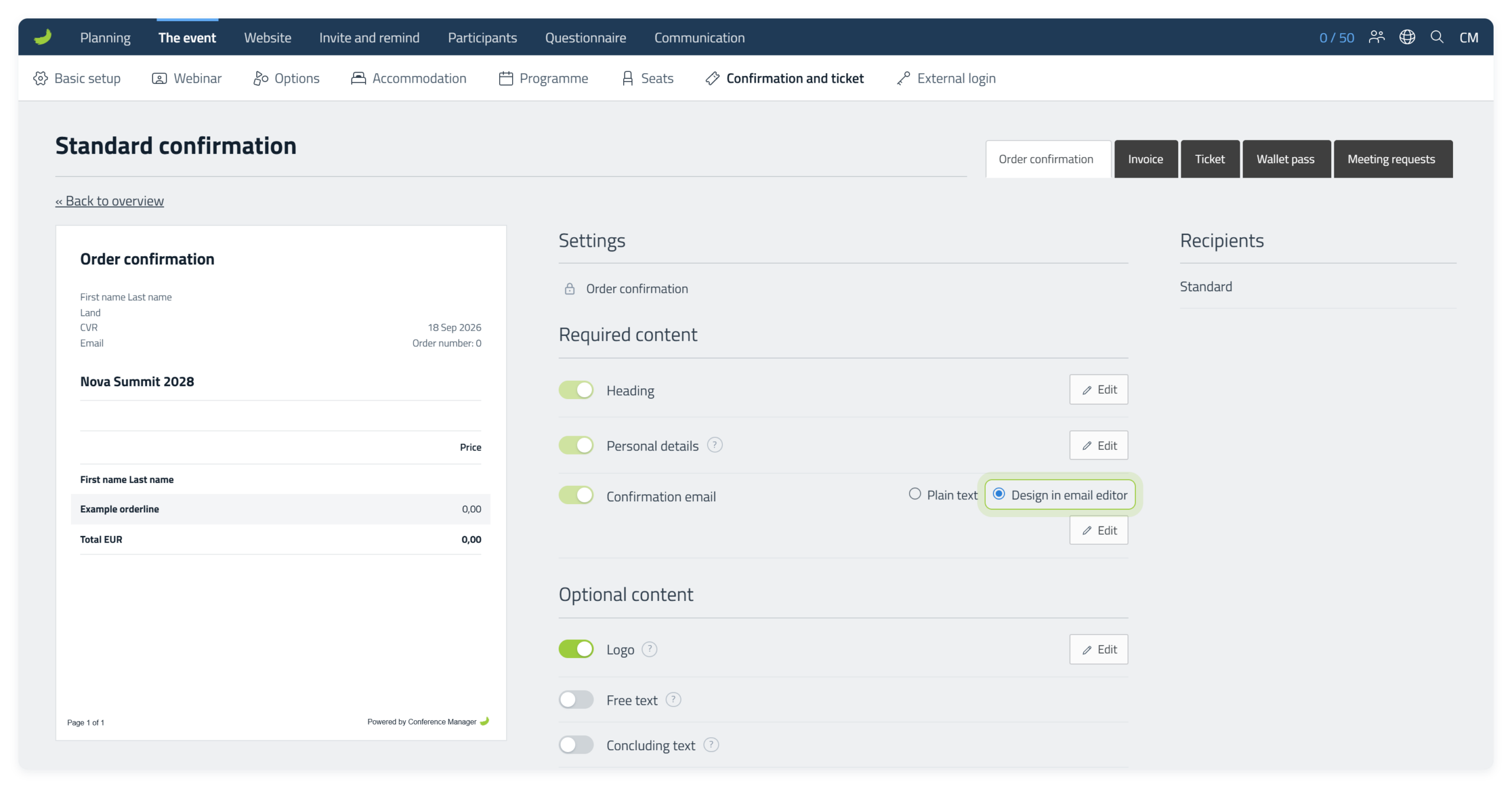
In the confirmation settings, choose Plain text or Design in email editor under Confirmation email. To design the confirmation in the email editor, select Design in email editor and then Edit.
Alternative sender name
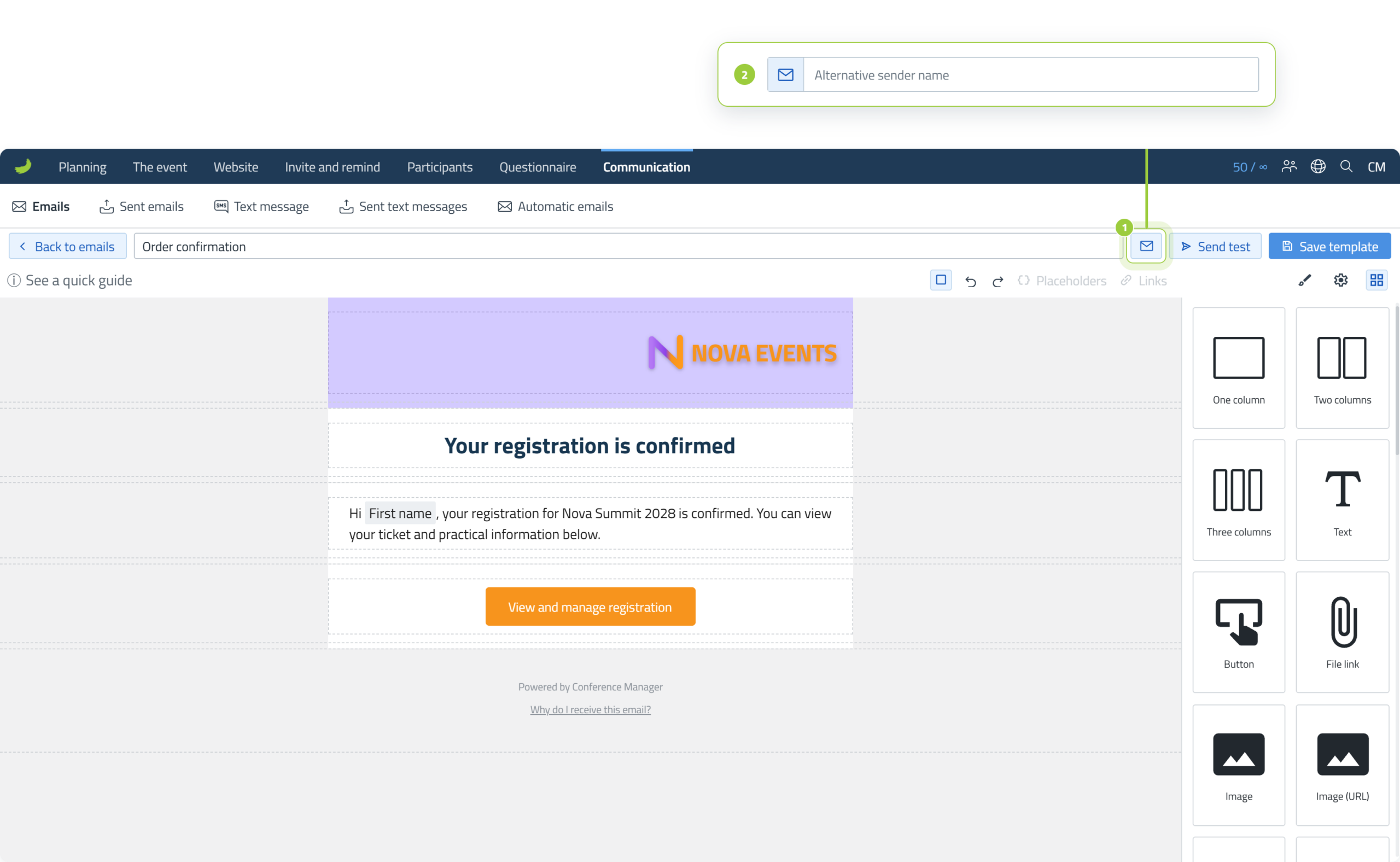
An alternative sender name is the name recipients see as the sender of the email. Because confirmation emails are sent automatically, they do not continue through the usual Dispatch flow where sender details are normally chosen.
For a confirmation email, enter the alternative sender name directly in the confirmation email editor instead.
Best practices and limitations
The email editor gives you a lot of flexibility, but email clients do not all render content in exactly the same way. These recommendations help keep the result easier to edit and more reliable for recipients.
If you choose to keep a pasted table or other formatted content, send real emails and check the result in as many relevant devices and email clients as possible before sending it to participants.